
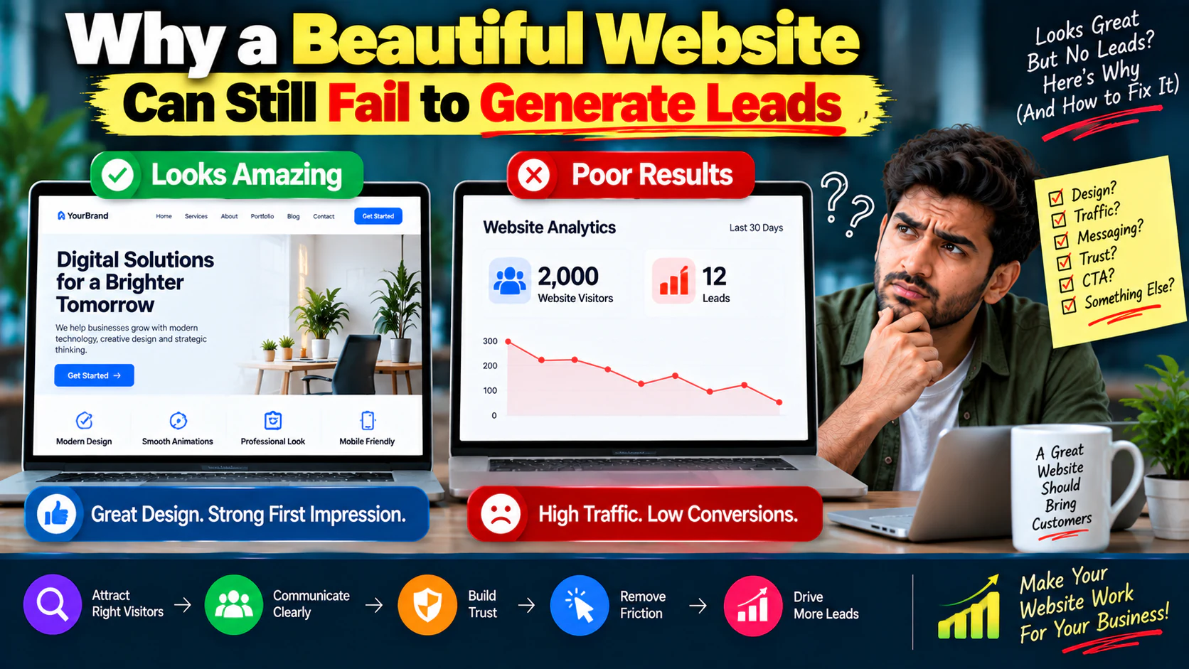
Your website looks great.
The colors are polished.
The animations are smooth.
The images are professional.
Your designer loves it.
Your team is proud of it.
Then you check the numbers.
And you start asking:
“Why isn't my website generating leads?”
The uncomfortable answer is that good design and good conversion are not the same thing.
A website can be visually impressive and commercially ineffective.
It can win compliments from colleagues while losing potential customers every day.
The real question isn't:
It's:
That's the difference between a website that looks good and a website that works as a business asset.
A Beautiful Website Is Not Automatically a High-Converting Website
A website has multiple jobs.
It needs to:
- Explain what you offer
- Make the right visitor feel understood
- Establish credibility
- Answer important questions
- Reduce uncertainty
- Make the next action obvious
- Work properly on mobile
- Load quickly
- Support SEO
- Track conversions
- Turn relevant traffic into enquiries or sales
Visual design is only one part.
Think about it this way:
If any of these fail, conversions can suffer.
The Traffic → Lead Equation
A simple way to think about website performance is:
Suppose your website gets:
and generates:
Your conversion rate is:
Now imagine the website is improved to:
At the same traffic level:
You doubled leads without doubling traffic.
That's why the answer to poor lead generation isn't always:
“We need more traffic.”
Sometimes you already have enough traffic.
You simply aren't converting enough of it.
The First Problem: Visitors Don't Understand What You Do
One of the most common website mistakes is vague messaging.
Imagine the homepage headline says:
“Transforming Businesses Through Innovation.”
Sounds professional.
But what does the company actually do?
The visitor shouldn't have to figure it out.
A stronger headline might say:
“Performance Marketing for E-commerce Brands That Want More Profitable Sales.”
Now the visitor immediately understands:
- What you do
- Who it's for
- What outcome you focus on
Your homepage should answer the basic question:
within seconds.
Your Hero Section Has a Serious Job
The hero section is not just the place for a large background image.
It needs to communicate:
What you offer
What is the product or service?
Who it is for
Which audience should care?
Why it matters
What outcome or problem does it address?
What to do next
What action should the visitor take?
A practical structure:
Clear value proposition.
Explain the problem/outcome.
The most important next step.
Client logos, review count, result, certification or relevant trust signal.
Don't Make Visitors Work to Understand Your Business
Suppose a visitor lands on your website after searching:
Your page talks about:
- Innovation
- Digital transformation
- Growth
- Creativity
- Technology
But doesn't clearly explain your SEO service.
The visitor has to investigate.
That's friction.
Good website messaging reduces the amount of thinking required.
Ask:
“If someone only reads the headline and first paragraph, will they understand why this page exists?”
If the answer is no, fix the message before redesigning the page.
The Second Problem: Your Website Is Designed for Everyone
Many websites try to speak to everyone.
The result?
They connect strongly with nobody.
A service page might say:
“We provide customized solutions for businesses of all sizes across multiple industries.”
Technically, that describes a broad market.
But it doesn't make a specific customer feel understood.
Compare:
“We help B2B service companies turn underperforming websites into lead-generation systems.”
That's much more specific.
Specificity creates relevance.
Your Website Needs a Clear Ideal Customer
Define:
- Industry
- Company size
- Business model
- Problem
- Buying trigger
- Desired outcome
- Main objection
Then build messaging around that customer.
For example:
Audience: B2B service company
Problem: Website gets traffic but few enquiries
Concern: Doesn't know whether traffic or website is the issue
Desired outcome: More qualified enquiries
CTA: Request a website conversion audit
Now the website has a job.
The Third Problem: Weak Calls to Action
Another common mistake:
The website explains everything.
Then the page ends.
No obvious next step.
Or the only CTA is:
That's often too generic.
Consider more contextual CTAs:
- Request a Website Audit
- Book a Strategy Call
- Get a Conversion Review
- Request a Quote
- See How the Process Works
- Get an E-commerce Growth Plan
The CTA should match the user's intent.
Don't Ask for Too Much Too Soon
Imagine someone has just discovered your company.
You immediately ask:
“Schedule a 60-minute consultation.”
That's a significant commitment.
A better first step may be:
The right CTA depends on the customer's buying stage.
Low intent
Read the guide.
Medium intent
View case studies.
High intent
Request consultation.
Very high intent
Get a quote.
Give people a logical next step.
The Fourth Problem: No Clear Value Proposition
Your website may describe your service.
But does it explain why someone should choose you?
There's a difference.
Feature
“Monthly SEO reporting.”
Benefit
“See exactly what your SEO investment is producing.”
Business outcome
“Understand which search growth is contributing to qualified enquiries.”
Move beyond features.
Explain the business impact.
The Fifth Problem: Not Enough Proof
You say:
“We deliver measurable results.”
The visitor thinks:
Trust needs evidence.
Useful proof includes:
- Case studies
- Testimonials
- Client logos
- Reviews
- Before/after examples
- Performance numbers
- Screenshots
- Process transparency
- Industry experience
- Certifications where relevant
The more expensive or important the decision, the more proof people usually need.
Use Proof Near the Decision Point
Don't hide testimonials on a separate page and expect everyone to find them.
Put proof near the CTA.
For example:
This gives the visitor a reason to act immediately after seeing evidence.
The Sixth Problem: Your Website Talks Too Much About You
Many company websites begin with:
“We are a leading company founded in…”
Then:
“Our mission is…”
Then:
“Our vision is…”
Then:
“Our values are…”
The customer is still wondering:
Your website should answer the visitor's questions before telling your entire corporate story.
A useful priority:
Not the other way around.
A website can lose leads simply because users don't know where to go.
Your navigation should help visitors answer:
Typical service-business navigation:
- Home
- Services
- Industries / Solutions
- Case Studies
- About
- Resources
- Contact
Don't turn the navigation into a giant sitemap.
Prioritize important customer journeys.
Every Important Page Needs a Job
Before creating a page, define its purpose.
| Page | Primary Job |
|---|---|
| Homepage | Explain positioning |
| Service page | Sell the service |
| Case study | Build proof |
| Blog | Capture/search intent |
| Landing page | Convert campaign traffic |
| About | Build credibility |
| Contact | Capture high-intent demand |
If you can't explain why a page exists, reconsider whether you need it.
Your Service Pages Shouldn't Be Brochures
A weak service page says:
“We offer SEO services including on-page SEO, technical SEO and link building.”
A stronger page addresses:
Problem
Your website isn't getting enough qualified organic traffic.
Diagnosis
There may be issues with technical structure, search intent, content depth or authority.
Solution
Here's how we approach it.
Process
Here's what happens after you engage us.
Proof
Here's evidence.
Outcome
Here's what the work is designed to improve.
CTA
Here's the next step.
That's a sales page—not a brochure.
The Eighth Problem: Too Much Design, Too Little Hierarchy
A visually complex page can actually reduce comprehension.
If every section has:
- Large images
- Animations
- Multiple colors
- Multiple buttons
- Moving elements
then nothing feels important.
Good design creates hierarchy.
The visitor should naturally notice:
Design should guide attention.
Not compete for it.
The Ninth Problem: Your Website Is Slow
A beautiful website that takes too long to load can lose users before they even see your design.
Potential causes include:
- Oversized images
- Unnecessary animations
- Too many scripts
- Heavy plugins
- Poor hosting
- Unoptimized fonts
- Third-party integrations
Performance is part of user experience.
Don't treat speed as a technical issue that belongs only to developers.
It can become a conversion issue.
The Tenth Problem: Mobile Was Treated as an Afterthought
A website might look excellent on desktop and frustrating on mobile.
Check:
- Text size
- Button size
- Form usability
- Menu navigation
- Image cropping
- Page spacing
- Sticky elements
- Popups
- Loading performance
Don't simply ask:
“Does the website fit on mobile?”
Ask:
“Can someone comfortably complete the desired action on mobile?”
Those are different questions.
Forms Can Kill Conversions
Suppose your service page has a beautiful CTA:
The user clicks.
Then they see a form asking for:
- Full name
- Company name
- Job title
- Phone
- Website
- Industry
- Company size
- Monthly revenue
- Marketing budget
- 10-question description
They leave.
The form may be asking for more information than the user is willing to provide at that stage.
Start with what the sales process genuinely needs.
You can collect additional information later.
Don't Confuse More Form Fields With Better Leads
More fields can help qualification.
But they can also reduce completion.
The right question is:
If you need:
- Name
- Phone
- Requirement
to begin the conversation, don't automatically request 15 fields.
Test.
Measure.
Improve.
Your CTA and Landing Page Must Match
Imagine someone clicks a Meta Ad promising:
“Get a Free E-commerce SEO Audit.”
The landing page headline says:
“Welcome to Our Digital Marketing Agency.”
That's a mismatch.
The user expected:
but received:
The message should continue.
should feel like one conversation.
This is especially important for paid traffic; a dedicated landing page structure for paid traffic can significantly reduce unnecessary friction.
The Eleventh Problem: No Clear Customer Journey
Your website shouldn't force every visitor through the same path.
Different visitors have different questions.
New visitor
Needs education.
Evaluating visitor
Needs proof.
Ready buyer
Needs an easy conversion path.
Your website should support all three.
A practical journey:
That's much more natural than forcing a visitor directly into a sales form.
Use Content to Build Buying Confidence
Suppose someone searches:
They aren't necessarily ready to hire you.
But they are thinking about buying.
Your content can answer:
- What affects pricing?
- What does SEO include?
- What results should be expected?
- How long does it take?
- What should businesses avoid?
- How should agencies be evaluated?
Then connect the article to:
or:
That's how content can become part of the conversion journey.
Your Website Needs Internal Links
Internal links aren't only for SEO.
They help users move through your website.
For example:
The user progresses from:
to
to
to
That's a strong information architecture.
Don't Ignore Search Intent
Suppose your page targets:
But the page is mostly a generic agency introduction.
The visitor expected:
- Dental SEO expertise
- Relevant problems
- Dental examples
- Specific services
- Relevant proof
- Expected outcomes
Search intent isn't just an SEO concept.
It's a conversion concept.
The page must match what the visitor expected to find.
SEO Traffic Doesn't Automatically Become Leads
Ranking is not the finish line.
Imagine:
That's a:
A page can rank well while converting poorly.
The next step isn't always:
Sometimes it's:
This is where SEO and conversion optimization need to work together.
Build Pages Around One Primary Intent
A page trying to:
- Rank for 20 unrelated topics
- Explain 5 services
- Sell 3 offers
- Target 4 audiences
can become confusing.
Give important pages a primary job.
For example:
Primary objective:
Supporting objectives:
- Explain service
- Build trust
- Answer objections
- Support SEO
Clear purpose creates better pages.
Your Website Should Answer Objections
Before contacting you, prospects may wonder:
- How much does it cost?
- How long does it take?
- Have you done this before?
- Will this work for my business?
- What exactly do I receive?
- What happens after I enquire?
- Can I cancel?
- Who will work on my account?
If your website doesn't answer these questions, the visitor has to find answers elsewhere.
Add:
This reduces uncertainty.
Make the Next Step Obvious
Every high-value page should have a clear next action.
For example:
Educational page
Service page
Case study
Product page
Comparison page
The visitor shouldn't have to ask:
“What am I supposed to do now?”
Don't Put Five Primary CTAs on One Screen
Suppose your hero has:
- Book a Call
- Download Guide
- See Pricing
- View Services
- Contact Us
Which one is primary?
If everything is important, nothing is clearly important.
Choose:
and perhaps:
This creates hierarchy.
Use Microcopy to Reduce Anxiety
Small supporting text can improve clarity.
Instead of:
Try:
Supporting text:
The user knows what will happen.
Uncertainty decreases.
Build Trust Before Asking for Contact Information
Think about the psychological sequence:
If your website jumps from:
directly to:
you're skipping important steps.
Use a Simple Conversion Page Framework
A strong service or landing page can follow:
Problem
What is going wrong?
Outcome
What does the customer want?
Solution
How do you help?
Benefits
Why does it matter?
Process
What happens next?
Proof
Why believe you?
Objections
What concerns need answering?
CTA
What should they do?
This structure works because it follows the customer's decision process.
Diagnose Before Redesigning
If your website isn't generating leads, don't immediately redesign it.
First inspect the funnel.
Step 1
How much traffic is coming?
Step 2
Where is it coming from?
Step 3
Which pages receive traffic?
Step 4
Which pages generate conversions?
Step 5
Where do users exit?
Step 6
Which CTA gets clicks?
Step 7
Where do users abandon forms?
Step 8
Is mobile behaving differently?
Then decide what to fix.
A Simple Website Conversion Diagnostic
Use this decision tree.
Traffic low?
Investigate:
Traffic healthy but engagement low?
Investigate:
Engagement healthy but CTA clicks low?
Investigate:
CTA clicks healthy but forms low?
Investigate:
Leads healthy but sales poor?
Investigate:
This prevents random redesigns.
Look at Page-Level Conversion Rates
Don't only measure the entire website.
Measure individual pages.
Example:
| Page | Visitors | Leads | Conversion |
|---|---|---|---|
| Homepage | 3,000 | 15 | 0.5% |
| SEO Service | 800 | 24 | 3% |
| Blog A | 1,500 | 3 | 0.2% |
| Landing Page | 700 | 42 | 6% |
The homepage may get the most traffic.
But the landing page may be much better at converting.
Traffic volume and commercial value aren't the same thing.
Find Your High-Intent Pages
Look for pages receiving visitors with stronger buying intent.
Examples:
- Service pages
- Pricing pages
- Case studies
- Comparison pages
- Product pages
- Contact pages
Then improve those pages first.
A small conversion improvement on a high-intent page can produce more business than a redesign of a low-intent blog.
Don't Forget Returning Visitors
Someone may not convert during the first visit.
They might:
That's normal.
Make returning visitors' journey easier through:
- Clear navigation
- Retargeting
- Email capture where appropriate
- Helpful content
- Case studies
- Strong service pages
Your website should support non-linear buying journeys.
Use Analytics to Find the Real Problem
Your analytics should help answer:
- Which pages get traffic?
- Which pages get engagement?
- Which pages generate conversions?
- Where do users leave?
- Which devices convert?
- Which traffic sources convert?
- Which landing pages perform best?
Don't collect analytics just to create reports.
Use the data to make decisions.
The Website Conversion Audit
Before redesigning your website, review these areas.
Messaging
- Headline is clear
- Audience is clear
- Problem is clear
- Value proposition is specific
UX
- Navigation is simple
- Important information is easy to find
- CTA hierarchy is clear
- Mobile experience works
Conversion
- Primary CTA is obvious
- Forms are reasonable
- Offers are relevant
- Conversion paths are measurable
Trust
- Testimonials exist
- Case studies exist
- Proof is visible
- Objections are addressed
Performance
- Pages load efficiently
- Images are optimized
- Scripts are controlled
- Mobile performance is acceptable
SEO
- Pages match search intent
- Important pages are indexable
- Internal links support navigation
- Content supports commercial pages
What Should You Fix First?
Use this priority order:
Priority 1 — Clarity
Can people understand the offer?
Priority 2 — Relevance
Does the page match the visitor's intent?
Priority 3 — Trust
Is there enough evidence?
Priority 4 — Conversion
Is the next step obvious?
Priority 5 — Friction
Are forms, navigation or mobile UX getting in the way?
Priority 6 — Optimization
What experiments can improve the numbers?
Only after these should you worry about whether the button has a slightly different shade.
When You Actually Need a Redesign
A redesign may make sense when:
- The information architecture is fundamentally broken
- The CMS prevents important changes
- The design creates serious usability problems
- The website is not responsive
- The technical foundation is outdated
- The brand positioning has changed
- Conversion problems are structural
- Performance problems require architectural changes
But if the website has:
you may not need a complete redesign.
You may need:
The “Before You Redesign” Rule
Before spending ₹3 lakh, ₹5 lakh or ₹10 lakh on a redesign, ask:
What exactly is broken?
Don't accept:
“The website feels old.”
Ask:
- What conversion metric is poor?
- Which pages are underperforming?
- What user behavior indicates the problem?
- What evidence supports the redesign?
- What will success look like after launch?
A redesign should solve measurable problems.
Not simply satisfy someone's taste.
A Practical Website Improvement Example
Imagine a service company has:
Conversion rate:
Instead of redesigning everything, the company improves:
Homepage headline
Makes the offer clearer.
Service pages
Adds outcomes and proof.
CTA
Changes from generic “Contact Us” to a specific consultation offer.
Forms
Reduces unnecessary fields.
Case studies
Adds relevant evidence.
Mobile UX
Improves CTA visibility.
Suppose conversion reaches:
At the same traffic:
That's:
without acquiring another visitor.
The point isn't that every website will achieve those exact numbers.
The point is that conversion improvement can create substantial growth from existing traffic.
Build a Website That Works With Your Marketing
Your website doesn't operate alone.
It receives traffic from:
- Social media
- Meta Ads
- Google Ads
- Direct traffic
- Referral traffic
- Partnerships
Each source can have different intent.
Your website should support those journeys.
For example:
The destination should match the visitor's context.
Your Website Is Part of the Marketing Funnel
Think of your complete funnel:
If your website sits between traffic and lead generation, it is not merely a digital brochure.
It is a conversion mechanism.
That's why web development decisions should be connected to marketing strategy.
Connect Website + SEO + Paid + Social
A mature website should be able to support:
SEO
Search-friendly architecture and content.
Paid
Campaign-specific landing pages.
Social
Easy-to-share content and relevant destinations.
Analytics
Reliable conversion tracking.
CRO
Testing and optimization.
This is why the website should be planned as part of the broader digital growth system rather than treated as an isolated design project.
The 10 Questions Every Business Website Should Answer
Before publishing a key page, ask:
- Who is this page for?
- What problem does it solve?
- What exactly do we offer?
- Why should the visitor care?
- Why should they trust us?
- What makes us different?
- What objections might they have?
- What evidence can we provide?
- What should they do next?
- Can we measure whether they did it?
If you can't answer these, the page probably needs work.
The Website Conversion Formula
A useful model is:
You can have excellent traffic.
But if:
the visitor leaves.
You can have great messaging.
But if:
the visitor hesitates.
You can have strong demand.
But if:
the visitor abandons.
The goal isn't perfection in one area.
It's removing the biggest constraint.
Your Website Doesn't Need to Be Fancy
It needs to be useful.
A simple page with:
- Strong headline
- Relevant offer
- Clear benefits
- Proof
- Good UX
- Strong CTA
can outperform a highly animated page that looks impressive but creates confusion.
Don't optimize for:
Optimize for:
The Complete “Why Isn't My Website Generating Leads?” Checklist
Messaging
- Can visitors understand the offer immediately?
- Is the target customer clear?
- Is the value proposition specific?
- Does the copy focus on customer problems?
Design
- Is the visual hierarchy clear?
- Are important elements easy to notice?
- Is there unnecessary visual complexity?
- Does design support the message?
UX
- Is navigation intuitive?
- Can visitors find services quickly?
- Is mobile experience smooth?
- Are forms easy to complete?
Trust
- Are testimonials visible?
- Are case studies available?
- Is proof relevant?
- Are objections addressed?
Conversion
- Is there a clear primary CTA?
- Does the CTA match user intent?
- Is the offer compelling?
- Are conversion actions measurable?
Traffic
- Where are visitors coming from?
- Are they relevant?
- Does landing-page content match traffic intent?
Analytics
- Are important conversions tracked?
- Are page-level conversion rates measured?
- Are drop-offs identified?
- Are mobile and desktop performance compared?
Optimization
- Have you identified the biggest bottleneck?
- Have you tested before redesigning?
- Are improvements based on evidence?