
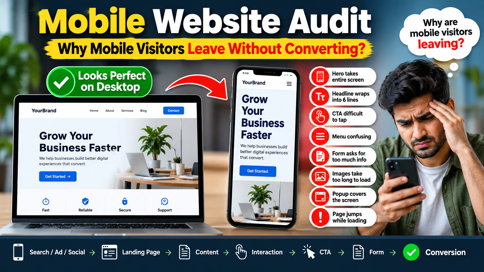
Your website may look perfect on a desktop monitor.
The layout is clean. The images look sharp. The buttons work. The navigation looks professional.
Then you check the website on a phone.
Suddenly:
- The hero section takes up the entire screen.
- The headline wraps into six lines.
- The CTA is difficult to tap.
- The menu feels confusing.
- The form asks for too much information.
- Images take too long to load.
- A popup covers the screen.
- Text is difficult to read.
- The page jumps while loading.
And then the business owner asks:
The answer is often not simply "mobile users have less patience."
The real problem is that the website was designed around a desktop experience and merely shrunk down for mobile.
That is not the same as designing for mobile.
A proper mobile website audit looks at the complete journey:
The goal is to identify exactly where mobile users experience friction.
Why Mobile Website Performance Matters
Mobile visitors don't experience your website the same way desktop visitors do.
A desktop user may have:
- Large screen
- Mouse
- Keyboard
- Stable broadband
- More visible navigation
- More space for comparison
A mobile user may have:
- Smaller screen
- Touch input
- Variable network quality
- Limited screen space
- Less room for navigation
- More interruptions
- Different browsing intent
That changes how the website should be designed and tested.
A website can technically be "responsive" while still being difficult to use.
That's the difference between:
and
The First Question: Is Your Website Actually Mobile-Friendly?
Don't answer this by opening the website on your own phone for 30 seconds.
Run through an actual user journey.
Imagine you are a new visitor.
Step 1
Open the website from a search result.
Step 2
Understand what the business offers.
Step 3
Find the relevant service/product.
Step 4
Understand why you should choose it.
Step 5
Find the CTA.
Step 6
Complete the action.
Now ask:
That number is more useful than simply saying:
Mobile Website Audit: The 10 Areas You Need to Check
A complete mobile audit should cover:
- Speed
- Layout
- Navigation
- Typography
- Buttons and touch targets
- Forms
- Content hierarchy
- Images and media
- Popups and interruptions
- Conversion journey
Let's examine each one.
Mobile Performance
The first problem is often speed.
A website may load reasonably well on desktop but become much heavier on mobile.
Why?
Because the mobile browser and device may have to process:
- JavaScript
- Images
- CSS
- Fonts
- Animations
- Third-party scripts
- Tracking tools
- Page-builder components
A page that feels acceptable on a powerful desktop computer can feel significantly slower on a mobile device.
What to Check
Test:
- Homepage
- Main service pages
- Product pages
- Blog pages
- Landing pages
- Contact page
Don't only test the homepage.
Your highest-value page may be a service page or campaign landing page.
For each page ask:
- Does the main content appear quickly?
- Is the hero image too large?
- Are unnecessary scripts loading?
- Does JavaScript delay interaction?
- Are fonts slowing rendering?
- Does the page remain responsive while loading?
If you're seeing broader performance issues, connect the investigation with your Core Web Vitals audit.
Check the First Screen
The first screen is extremely important.
When someone opens your website on mobile, what do they see?
A good first screen should quickly communicate:
- Who you are
- What you offer
- Why it matters
- What the user should do next
A common mistake is filling the first screen with:
- Giant background image
- Complex animation
- Huge headline
- Multiple decorative elements
- Navigation
- Social icons
- Floating widgets
The user may have to scroll before discovering what the business actually does.
Example
Imagine a digital marketing agency's mobile homepage.
The first screen contains:
Then a large animation.
Then another section.
Then another section.
The visitor still doesn't know:
- What services are offered
- Who the agency serves
- What makes it different
- How to contact the company
A stronger mobile hero might communicate:
Supporting line:
CTA:
The second version reduces cognitive load.
Desktop navigation often has plenty of horizontal space.
Mobile doesn't.
A mobile menu should help users answer:
Check:
- Is the menu easy to find?
- Is the menu icon obvious?
- Does it open reliably?
- Are menu items readable?
- Are important pages easy to access?
- Are there too many menu levels?
- Is the CTA visible?
- Can users close the menu easily?
The Mega Menu Problem
A desktop mega menu with:
- 30 links
- Multiple columns
- Dropdowns
- Categories
- Subcategories
may be useful on desktop.
On mobile, the same structure can become a frustrating maze.
Mobile navigation should prioritize:
Not:
Check Typography
Text that looks perfect on desktop can become difficult to read on mobile.
Check:
- Font size
- Line height
- Paragraph width
- Heading size
- Heading wrapping
- Contrast
- Font loading
- Text spacing
The objective is not to make every heading enormous.
A mobile heading should communicate hierarchy without consuming half the screen.
Watch for Excessive Heading Wrapping
Imagine a heading:
On desktop, it might fit across two lines.
On a narrow mobile screen, it may become:
Complete Digital Marketing Solutions for Growing Businesses in India
That's not automatically bad.
But if every section produces five- or six-line headings, the page becomes unnecessarily long.
Review mobile typography as a deliberate design system.
Audit Buttons and Touch Targets
A button that is easy to click with a mouse may be difficult to tap with a finger.
Check:
- Button size
- Spacing between buttons
- Text readability
- Touch area
- Position
- Sticky CTA behavior
- Accidental-click risk
Two buttons placed too close together can create a frustrating experience.
For example:
may look fine on desktop.
On mobile, they need sufficient separation.
Audit Forms
Forms are one of the biggest mobile conversion bottlenecks.
Consider a lead form asking for:
- Name
- Company
- Job title
- Phone
- Website
- City
- Industry
- Budget
- Team size
- Message
A desktop visitor may tolerate this.
A mobile visitor may abandon it.
The key question is:
If not, consider removing it.
Mobile Form Checklist
Check:
- Are fields large enough?
- Is the keyboard appropriate for each field?
- Does the email field trigger an email-friendly keyboard?
- Is the phone field optimized for numbers?
- Are error messages obvious?
- Does the form preserve entered data after an error?
- Is autofill supported?
- Is the CTA clearly visible?
- Is unnecessary scrolling minimized?
A form can be technically functional while still creating enormous conversion friction.
Check Content Hierarchy
Mobile users scroll vertically.
That means the sequence of information matters.
A good service page might follow:
A poor mobile page may look like:
The content may all be good.
The sequence is wrong.
Mobile design forces you to prioritize.
Audit Images and Videos
Media is often responsible for both performance and usability problems.
Check:
- Image dimensions
- File sizes
- Responsive image delivery
- Modern formats
- Lazy loading
- Video backgrounds
- Autoplay
- Poster images
- Mobile-specific assets
Be Careful With Video Backgrounds
A video background can look impressive on desktop.
On mobile, it may:
- Consume bandwidth
- Increase loading time
- Increase processing requirements
- Distract from the message
- Create accessibility problems
- Make the first screen unnecessarily heavy
Ask:
If not, it may be decoration with a measurable performance cost.
Audit Popups and Interruptions
Popups can help generate leads.
They can also destroy the mobile experience.
Common examples:
- Newsletter popup
- Discount popup
- Chat widget
- Cookie notice
- App-install prompt
- Exit-intent message
- Promotional banner
On a small screen, these can cover almost the entire page.
The Question to Ask
Don't ask:
Ask:
A popup shown immediately after page load may interrupt a visitor who hasn't even understood the offer.
A popup shown after meaningful engagement may have a much stronger reason to exist.
Audit the Conversion Journey
This is where mobile website auditing becomes commercially important.
Don't stop after checking:
Follow the complete conversion path.
For example:
or:
or:
At every step ask:
What does the visitor see?
What action should they take?
Is the next step obvious?
How many taps are required?
What can go wrong?
What could cause abandonment?
This is where many mobile problems become visible.
The Mobile Conversion Friction Audit
Score each area from:
Audit:
| Area | Score |
|---|---|
| Page speed | /3 |
| Hero clarity | /3 |
| Navigation | /3 |
| Typography | /3 |
| CTA visibility | /3 |
| Button usability | /3 |
| Form friction | /3 |
| Content hierarchy | /3 |
| Images/media | /3 |
| Popups | /3 |
| Trust signals | /3 |
| Checkout/contact journey | /3 |
A high score tells you where to prioritize.
Why Mobile Visitors Leave Without Converting
Let's look at some of the most common patterns.
Problem 1: They don't understand the offer quickly
The visitor lands on the page and thinks:
If the answer isn't obvious, they leave.
Problem 2: The CTA is buried
The user understands the offer but cannot easily find:
- Contact
- Buy
- Book
- Request quote
- Call
The page has information but no obvious next action.
Problem 3: The website feels slow
Users may abandon before the important content appears.
Problem 4: The form is too long
Every additional field introduces another decision and another opportunity to abandon.
Problem 5: The website feels difficult to use
Small buttons.
Tiny text.
Confusing menus.
Horizontal scrolling.
Overlapping elements.
These problems destroy trust quickly.
Problem 6: Too many interruptions
A user opens the page and immediately sees:
- Cookie popup
- Newsletter popup
- Chat widget
- Promotional banner
The actual content is hidden.
The user leaves.
Mobile Audit Example: A Local Service Business
Imagine a business receives:
Current conversion rate:
That produces:
The audit discovers:
- CTA appears only after significant scrolling
- Form has 10 fields
- Phone number is difficult to tap
- Hero image is unnecessarily large
- WhatsApp button overlaps page content
- Navigation has too many items
- Testimonials appear before the actual service explanation
Instead of simply redesigning the website, prioritize:
- Clarify the mobile hero.
- Make the primary CTA immediately visible.
- Simplify the form.
- Fix touch usability.
- Optimize the hero asset.
- Rework navigation.
- Move trust signals closer to the decision point.
If conversion rate rises from:
5,000 visitors would produce:
That's approximately:
The exact improvement will depend on traffic quality, offer, audience and implementation.
But the principle is important:
Mobile SEO and User Experience Are Connected
Mobile website problems aren't only about conversion.
They can also affect how users experience your organic search journey.
Imagine someone searches for:
They click your result.
The page loads.
The visitor sees a huge image.
They scroll.
The heading is unclear.
The navigation is difficult.
The CTA is buried.
Even if your search result attracted the click, the website experience may fail to convert that opportunity.
That's why SEO should not end at the search result.
The journey continues:
Mobile Performance and Paid Advertising
The same principle applies to paid traffic.
Suppose you spend:
You generate:
If the landing page is difficult to use on mobile, some of that advertising budget is effectively being wasted after the click.
The problem isn't necessarily:
It may be:
Before increasing the ad budget, check the landing page.
This is particularly important for lead-generation campaigns.
Mobile Website Audit: 30-Point Checklist
Performance
- Does the page load quickly on mobile?
- Is the hero asset optimized?
- Are unnecessary scripts being loaded?
- Is JavaScript delaying interaction?
- Are fonts optimized?
Layout
- Is there horizontal scrolling?
- Are sections unnecessarily tall?
- Are elements overlapping?
- Does the layout remain stable while loading?
- Is the first screen useful?
Navigation
- Is the menu easy to access?
- Are important pages easy to find?
- Is the menu too deep?
- Is the primary CTA accessible?
- Can users close navigation easily?
Typography
- Is body text readable?
- Are headings excessively large?
- Do headings wrap awkwardly?
- Is line spacing comfortable?
- Is contrast sufficient?
Interaction
- Are buttons easy to tap?
- Are nearby controls sufficiently separated?
- Are forms easy to complete?
- Are error messages clear?
- Does the website respond quickly to interaction?
Conversion
- Is the CTA obvious?
- Is the value proposition clear?
- Are trust signals visible at the right point?
- Are unnecessary form fields removed?
- Can the visitor complete the desired action without friction?
A Better Way to Prioritize Mobile Fixes
Not every issue deserves immediate development time.
Use this framework:
Impact
How many users are affected?
Severity
Does the issue cause inconvenience or prevent conversion?
Business value
Does the affected page generate leads or revenue?
Effort
How difficult is the fix?
A useful prioritization formula is:
For example:
Fix A
Change button spacing.
Impact: High Effort: Low
Fix B
Redesign an entire decorative animation.
Impact: Low Effort: High
This keeps the team focused on business outcomes.
What to Fix First on a Mobile Website
If you discover many problems, use this order.
Priority 1: Conversion blockers
Fix:
- Broken forms
- Unusable buttons
- Hidden CTAs
- Broken navigation
- Checkout problems
Priority 2: Performance blockers
Fix:
- Large assets
- Excessive JavaScript
- Slow server response
- Heavy third-party scripts
Priority 3: Clarity problems
Fix:
- Weak hero messaging
- Confusing content hierarchy
- Poor page structure
Priority 4: Usability problems
Fix:
- Typography
- Spacing
- Menu complexity
- Form usability
Priority 5: Visual refinement
Only after the major issues are addressed should you spend significant time on decorative improvements.
Don't Make These Mobile Optimization Mistakes
"The website is responsive, so we're done."
Responsive does not automatically mean usable.
Only test your own phone
Your device, connection and browsing behavior may not represent your audience.
Optimize only the homepage
Your highest-value mobile traffic may arrive on a service page, product page or campaign landing page.
Make every button sticky
A sticky CTA can help.
Too many sticky elements can consume most of the screen.
Hide desktop content without thinking
Mobile users may still need important information.
The goal is not:
The goal is:
Add more popups to increase leads
More interruptions do not automatically mean more conversions.
Test timing, placement and relevance.
Ignore mobile forms
A great landing page with a frustrating form can still produce poor conversion rates.
When Should You Redesign the Mobile Experience?
Consider a deeper redesign when:
- Mobile traffic is high but conversions are low.
- Desktop conversion significantly outperforms mobile.
- Navigation is fundamentally difficult.
- The current design was never built around mobile.
- Mobile performance remains poor after optimization.
- The website has accumulated too many components.
- Conversion paths require excessive scrolling or tapping.
- Mobile users frequently abandon key forms or checkout steps.
However, don't assume every low conversion rate is caused by mobile UX.
Also investigate:
- Traffic quality
- Offer
- Pricing
- Messaging
- Trust
- Search intent
- Ad targeting
- Form qualification
- Sales follow-up
Mobile optimization should solve genuine mobile problems, not become a convenient explanation for every conversion problem.
The Complete Mobile Audit Process
Use this process for every important page.
Step 1 — Identify the page objective
Is it designed to:
- Inform?
- Generate leads?
- Sell?
- Book?
- Educate?
- Drive contact?
Step 2 — Identify the primary mobile user
Where did they come from?
- Ads
- Referral
Step 3 — Test the first screen
Can they understand the offer immediately?
Step 4 — Test navigation
Can they find the next relevant page?
Step 5 — Test performance
Is the page responsive while loading?
Step 6 — Test interaction
Can buttons, menus and forms be used comfortably?
Step 7 — Test conversion
Can the visitor complete the desired action?
Step 8 — Record friction
Don't just record errors.
Record moments where the user has to:
- Think
- Search
- Wait
- Scroll unnecessarily
- Tap repeatedly
- Re-enter information
- Close an interruption
Step 9 — Prioritize
Fix the highest-value problems first.
Step 10 — Retest
Measure the experience after implementation.
The Final Mobile Website Audit Question
At the end of your audit, ask:
"If I were a first-time visitor using only my phone, would I know what this business offers, why I should trust it, and exactly what I should do next?"
If the answer is no, you have a mobile conversion problem.
And that problem may have nothing to do with whether the website "looks good."
SEO Publishing Information
| Field | Details |
|---|---|
| Blog ID | WEB-09 |
| Category | Web Development |
| Stage | Diagnose |
| Primary Keyword | mobile website audit |
| Supporting Keywords | mobile website problems; mobile conversion optimization; mobile UX audit |
| Search Intent | Problem Solving |
| Funnel Stage | Problem Aware |
| Pillar Page | Web Development Services |
| Suggested URL | `/blog/web-development/mobile-website-audit-why-mobile-visitors-leave-without-converting` |
| Content Role | Diagnostic / conversion-focused resource |
| Publishing Sprint | Sprint 5 |
| CTA | Request a website audit / Explore Web Development |
| Meta Title | Mobile Website Audit: Why Visitors Leave Without Converting |
| Meta Description | Find mobile website problems that cause visitors to leave, from speed and navigation to forms, CTAs, usability and conversion friction. |
| H1 | Mobile Website Audit: Why Mobile Visitors Leave Without Converting |
Recommended CTA
A mobile website audit can identify the friction points affecting speed, usability, navigation, forms and conversion paths—so you can fix the problems that actually matter.