
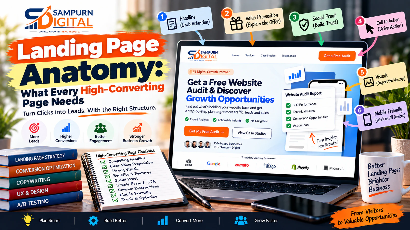
A landing page can look perfect and still fail.
You can have:
- A beautiful hero section
- Professional graphics
- Strong branding
- Smooth animations
- A modern layout
- Excellent copy
…and still generate very few leads or sales.
Why?
Because conversion does not come from appearance alone.
A landing page has to answer a sequence of questions in the visitor's mind:
If your page fails at any one of these stages, visitors can leave before converting.
This guide breaks down the anatomy of a high-converting landing page—from the first headline to the final CTA—and explains what each section should accomplish.
What Is a Landing Page?
A landing page is a focused page designed around a specific audience, offer, campaign, or conversion goal.
Unlike a normal website page, a landing page usually has a much narrower purpose.
For example:
Google Ads campaign
“Google Ads Management for E-commerce Businesses”
Lead generation campaign
“Get a Free Website Conversion Audit”
SaaS campaign
“Start Your 14-Day Free Trial”
Webinar
“Register for the Digital Growth Masterclass”
Product campaign
“Buy the New Product Launch Bundle”
The visitor arrives with a specific expectation.
The landing page needs to continue that conversation.
Landing Page vs Homepage
This distinction is critical.
A homepage is designed for multiple audiences and multiple journeys.
A landing page is designed for a specific journey.
Homepage
Many audiences ↓ Many messages ↓ Many destinations
Landing page
Specific audience ↓ Specific promise ↓ Specific offer ↓ Specific CTA
For example:
An ad says:
“Reduce Google Ads CPA by Improving Campaign Structure.”
If the visitor clicks and lands on your homepage, they may see:
- SEO
- Web Development
- Social Media
- About
- Blog
- Careers
- Contact
The original promise has disappeared.
A dedicated landing page keeps the visitor focused on the specific problem and solution.
The Anatomy of a High-Converting Landing Page
A strong landing page can follow this structure:
- Ad / Traffic Message ↓
- Hero ↓
- Immediate Value ↓
- Problem ↓
- Solution ↓
- Benefits ↓
- How It Works ↓
- Proof ↓
- Objection Handling ↓
- Offer ↓
- CTA ↓
- Final Reassurance
Not every page needs every section.
The correct structure depends on:
- Offer complexity
- Price
- Audience
- Traffic temperature
- Trust requirements
- Conversion type
Message Match: Start Before the Landing Page
Your landing page actually begins before the visitor reaches it.
It begins with the:
If the traffic source promises one thing and the landing page talks about something else, conversion rates suffer.
For example:
Ad
“Get a Free Technical SEO Audit”
Landing page headline
“Grow Your Business Online”
There is a mismatch.
The visitor expected:
but received:
A stronger landing page would say:
“Get a Free Technical SEO Audit for Your Website”
The message continues naturally.
The Hero Section
The hero is the first major conversion decision point.
It should communicate:
- What is being offered
- Who it is for
- Main benefit
- Primary action
A useful structure:
[Primary CTA]
Relevant visual
The Landing Page Headline Formula
Try:
For example:
“Generate More Qualified B2B Leads With a Conversion-Focused Website.”
“Get More E-commerce Sales Without Simply Increasing Your Ad Budget.”
“Launch a Fast, SEO-Ready Business Website Without Starting From Scratch.”
The headline should make the offer understandable immediately.
Supporting Copy
The headline gets attention.
The supporting copy adds context.
For example:
“We audit your website structure, messaging, user journey and conversion points to identify the changes most likely to improve qualified enquiries.”
This answers:
Keep the copy focused.
The hero isn't the place for your company's entire history.
The Primary CTA
Your CTA should tell the visitor exactly what happens when they click.
Weak:
Submit
Better:
Get My Free Audit
Weak:
Click Here
Better:
Book a Strategy Call
Weak:
Learn More
Better:
See How It Works
The CTA should communicate the next step.
CTA Copy Should Match the Offer
| Offer | Better CTA |
|---|---|
| Website audit | Get My Website Audit |
| Consultation | Book a Consultation |
| Demo | Request a Demo |
| Quote | Get a Project Estimate |
| Trial | Start Free Trial |
| Download | Download the Guide |
| Webinar | Reserve My Seat |
Avoid generic CTA text when a specific action is possible.
Reinforce the Value Immediately
After the hero, answer:
“Why should I care?”
Use three to five concise benefits.
For example:
Identify Conversion Problems
Find the pages and steps where visitors are dropping off.
Prioritize Improvements
Focus on changes based on business impact rather than random design preferences.
Get a Clear Action Plan
Know what should be fixed first, second and third.
This is more useful than listing vague features.
Features vs Benefits
A feature describes what something has.
A benefit explains why the visitor should care.
Feature
“Includes conversion tracking analysis.”
Benefit
“See which campaigns and pages are actually producing qualified leads.”
Whenever possible, connect the feature to the outcome.
Explain the Problem
Now make the visitor feel understood.
For example:
“Your campaigns may be generating clicks, but if visitors land on a generic or confusing page, you're paying for traffic that has little chance of converting.”
Then explain symptoms:
- High bounce rate
- Low conversion rate
- Expensive leads
- Many clicks but few enquiries
- Low-quality submissions
- Visitors abandoning forms
- Strong ad performance but weak revenue
The objective is not to scare visitors.
It is to establish relevance.
Explain Why the Problem Exists
This section can be especially powerful for complex services.
For example:
Problem
High paid traffic but low leads.
Possible causes
- Ad-to-page mismatch
- Weak headline
- Unclear offer
- Too many distractions
- Poor proof
- Weak CTA
- Long form
- Slow page
- Mobile UX problems
Now the visitor understands that the problem has identifiable causes.
That creates a natural transition into your solution.
Present the Solution
Once you've established the problem, show your method.
For example:
Audit ↓ Identify Friction ↓ Prioritize Opportunities ↓ Implement Changes ↓ Measure ↓ Optimize
This is much more persuasive than:
“We use our proprietary methodology.”
Explain what actually happens.
Show the Benefits
A landing page should make the outcome tangible.
Depending on the offer, benefits could include:
- More qualified enquiries
- Lower acquisition costs
- Faster sales cycles
- Better lead quality
- Higher conversion rates
- Easier purchasing
- Reduced manual work
- Better customer experience
Don't promise outcomes you cannot control.
Instead of:
“We guarantee 5× more leads.”
say:
“We identify and prioritize the changes most likely to improve conversion performance based on your existing traffic and customer journey.”
Credibility beats hype.
Explain How It Works
A simple three- to five-step process works well.
Example:
01 Tell Us About Your Business
02 We Review Your Website
03 We Identify Conversion Friction
04 You Receive Prioritized Recommendations
05 You Decide What to Implement
This reduces uncertainty.
The visitor knows what happens after clicking.
Add Relevant Proof
People are naturally skeptical of marketing claims.
Use proof wherever possible.
Proof types
- Client logos
- Testimonials
- Case studies
- Screenshots
- Results
- Reviews
- Certifications
- Before/after examples
- Product usage numbers
But proof should be relevant.
If your landing page sells SEO services, a random award for “best workplace” doesn't necessarily help the visitor decide.
Use evidence related to the offer.
Use Results With Context
A standalone number:
“+200% Growth”
is weak.
What grew?
Over what period?
For which business?
After what changes?
A stronger example:
“Organic qualified enquiries increased 82% over six months after restructuring service pages and building supporting content.”
Context makes numbers believable.
Use Testimonials Correctly
A useful testimonial contains:
Example:
“We were receiving website traffic but very few enquiries. The new landing-page structure made our offer much clearer, and our sales team started receiving more relevant enquiries.”
This is much more powerful than:
“Amazing service\!”
Add Social Proof Near Decision Points
Don't hide all proof at the bottom.
Place relevant trust elements near moments where the visitor might hesitate.
For example:
Near the hero
Client logos.
Near the offer
Rating or testimonial.
Near the form
Privacy reassurance.
Near pricing
Customer results.
Proof should appear when doubt appears.
Address Objections
Before converting, visitors often have silent objections.
For example:
“Is this actually for a business like mine?”
“How long will it take?”
“Will I need to change my entire website?”
“What if we already have an agency?”
“How much does it cost?”
“Will someone call me immediately?”
“Will you spam me?”
Your landing page should answer the most important objections.
The Objection → Answer Framework
| Objection | Response |
|---|---|
| “Is this right for me?” | Define ideal customer |
| “Is it difficult?” | Explain simple process |
| “Can I trust you?” | Show proof |
| “Will it work?” | Show relevant results |
| “What happens next?” | Explain process |
| “Will I be pressured?” | Set expectations |
| “How much?” | Provide pricing guidance where appropriate |
Good landing pages reduce uncertainty.
Make the Offer Concrete
Don't make visitors guess what they're getting.
Instead of:
“Get access to our expert services.”
Explain:
You Receive
- Website conversion review
- UX friction analysis
- CTA review
- Mobile usability check
- Priority recommendations
- Action plan
Specific deliverables increase perceived value.
Use Scarcity Carefully
Scarcity can work when it is real.
For example:
“We accept 5 new strategy projects each month.”
if that is genuinely true.
Avoid fake countdown timers that reset every time someone visits.
Artificial urgency can damage trust.
Keep the Form Proportional to the Offer
A free checklist may only need:
A consultation may need:
- Name
- Company
- Website
- Requirement
A ₹5 lakh development project may justify more qualification questions.
The principle:
Reduce Form Anxiety
Add reassurance near the form.
For example:
“We'll review your request and contact you within one business day.”
“No obligation. We'll first understand your requirements.”
If applicable, also mention:
- Privacy
- No spam
- No obligation
- Expected response time
Small details can reduce hesitation.
This is one of the biggest differences between a homepage and a landing page.
A homepage says:
“Here are all the places you can go.”
A landing page says:
“Here's the specific action we want you to consider.”
If visitors can click:
- About
- Blog
- Careers
- Services
- Team
- 14 social links
- Five unrelated offers
they may leave the conversion path.
For campaign landing pages, minimize unnecessary distractions.
That does not mean every landing page must have literally zero navigation.
It means every element should have a reason to exist.
Use Visual Hierarchy
The page should make priorities obvious.
A visitor should visually understand:
before reading every word.
Use:
- Clear headings
- Short paragraphs
- Bullet points
- Whitespace
- Visual contrast
- Cards where useful
- Meaningful images
- Strong CTA placement
Good design reduces cognitive effort.
Don't Hide Important Information Below the Fold
“Above the fold” doesn't mean every detail must appear immediately.
But the first screen should establish:
- What is being offered
- Who it is for
- Why it matters
- What action to take
The visitor should not need to scroll halfway down the page just to understand what you're selling.
Design for Mobile
A landing page that looks excellent on desktop can fail badly on mobile.
Check:
Hero
Can the headline be read without excessive scrolling?
CTA
Can the button be tapped comfortably?
Form
Are fields easy to complete?
Images
Are they slowing the page?
Sections
Can visitors scan them easily?
Sticky CTA
Would a mobile sticky action improve accessibility?
Mobile isn't an afterthought.
For businesses running paid traffic, mobile landing-page performance can directly affect campaign economics.
Improve Landing Page Speed
Every additional second of friction can matter.
Review:
- Image sizes
- Video loading
- Fonts
- JavaScript
- Third-party scripts
- Tracking tools
- Pop-ups
- Animation
- Hosting
- Caching
Don't create a beautiful landing page that takes forever to load.
The best landing-page design cannot convert a visitor who never waits for the page to appear.
Connect Analytics and Conversion Tracking
You need to know what happens after the visitor arrives.
Track events such as:
- Landing-page view
- CTA click
- Form start
- Form completion
- Phone click
- WhatsApp click
- Calendar booking
- Purchase
- Download
For lead generation, don't stop at:
If possible, continue measuring:
A landing page that produces 100 low-quality leads may be worse than one producing 40 qualified leads.
Match Landing Pages to Traffic Intent
Different campaigns may deserve different landing pages.
For example:
Campaign A “SEO Audit” ↓ SEO Audit Landing Page
Campaign B “E-commerce SEO” ↓ E-commerce SEO Landing Page
Campaign C “Local SEO” ↓ Local SEO Landing Page
Sending all three campaigns to the same generic page makes personalization harder.
Don't Make One Landing Page Do Everything
If you sell five different services, you don't necessarily need one giant landing page containing all five.
The more specific the traffic intent, the more specific the page can be.
For example:
Traffic
“Google Ads management for e-commerce”
Page
“Google Ads Management for E-commerce Brands”
CTA
“Request a Google Ads Account Review”
That's a coherent journey.
Use a Strong Final CTA
The bottom of the page should not simply say:
“Thanks for reading.”
Give the visitor a final reason to act.
For example:
Ready to Find Out What's Holding Your Website Back?
Get a practical conversion review focused on the pages, messaging and user journeys that may be preventing visitors from becoming leads.
Then add reassurance:
No obligation. We'll first review your requirements and explain the recommended next steps.
The Complete Landing Page Wireframe
┌─────────────────────────────────────┐ │ LOGO CTA │ ├─────────────────────────────────────┤ │ │ │ HEADLINE │ │ │ │ Supporting statement │ │ │ │ [PRIMARY CTA] │ │ │ │ Relevant visual │ ├─────────────────────────────────────┤ │ TRUST │ │ Logos / Rating / Proof │ ├─────────────────────────────────────┤ │ PROBLEM │ ├─────────────────────────────────────┤ │ SOLUTION │ ├─────────────────────────────────────┤ │ BENEFITS │ ├─────────────────────────────────────┤ │ HOW IT WORKS │ ├─────────────────────────────────────┤ │ RESULTS / PROOF │ ├─────────────────────────────────────┤ │ TESTIMONIALS │ ├─────────────────────────────────────┤ │ OBJECTIONS / FAQ │ ├─────────────────────────────────────┤ │ OFFER │ ├─────────────────────────────────────┤ │ FINAL CTA │ └─────────────────────────────────────┘
Again, treat this as a framework rather than a rigid template.
Landing Page Copy Framework
A useful copywriting sequence is:
Attention
What is this?
Relevance
Is this for me?
Problem
Why do I need it?
Solution
How does it help?
Benefits
What's in it for me?
Proof
Can I believe you?
Risk Reduction
What could go wrong?
Offer
What exactly am I getting?
Action
What do I do now?
This sequence follows how many visitors naturally evaluate an unfamiliar offer.
Example: Lead Generation Landing Page
Imagine a company offers website conversion audits.
A weak page:
Improve Your Website
We provide professional digital solutions.
[Contact Us]
A stronger page:
Is Your Website Getting Traffic but Not Enough Enquiries?
Get a practical website conversion review that identifies the biggest friction points across your messaging, UX, CTAs, mobile experience and lead journey.
What You'll Discover
- Where visitors may be dropping off
- Whether your offer is immediately clear
- Whether your CTAs create unnecessary friction
- Which pages deserve attention first
- What conversion improvements should be prioritized
How It Works
Now the visitor understands:
- Problem
- Offer
- Deliverables
- Process
- Action
That's the foundation of a conversion-focused page.
Landing Page Testing: What Should You Change First?
Don't randomly change 20 things at once.
Start with high-impact elements.
Priority 1: Offer
Is the offer itself compelling?
Priority 2: Audience
Is the page clearly relevant to the visitor?
Priority 3: Headline
Does the headline communicate the value?
Priority 4: CTA
Is the next action clear?
Priority 5: Proof
Is there enough evidence?
Priority 6: Friction
Is the form or process unnecessarily difficult?
Priority 7: Design
Does the layout make the message easier to understand?
Priority 8: Performance
Does the page load quickly and work properly?
This creates a better testing hierarchy than immediately changing button colors.
Landing Page Conversion Metrics
Track more than conversion rate.
Useful metrics include:
Landing Page Conversion Rate
Example:
2,000 visitors
80 leads
CTA Click Rate
Form Start Rate
Form Completion Rate
Cost Per Lead
Cost Per Qualified Lead
This can be much more useful than basic CPL.
Example: Why Conversion Rate Alone Can Mislead
Campaign A:
Conversion rate \= 5%
But only 20 are qualified.
Campaign B:
Conversion rate \= 3%
But 60 are qualified.
Campaign B may be much more valuable.
So evaluate:
not simply:
45-Point High-Converting Landing Page Checklist
Message
- Traffic and landing-page message match
- Audience is clear
- Offer is clear
- Main benefit is obvious
- Headline is specific
Hero
- Supporting copy adds clarity
- Primary CTA is visible
- Visual supports the offer
- Trust indicator is available
- No unnecessary distractions
Problem
- Customer problem is clearly described
- Symptoms are recognizable
- Causes are explained where useful
- Messaging feels customer-focused
- Problem naturally leads to the solution
Solution
- Solution is specific
- Benefits are clear
- Deliverables are understandable
- Process is explained
- Expectations are realistic
Trust
- Relevant proof is included
- Testimonials are specific
- Case studies are relevant
- Claims are substantiated
- Proof appears near decision points
Conversion
- CTA is specific
- Form is proportional
- Form fields have a purpose
- Contact process is clear
- Reassurance is provided
UX
- Page is easy to scan
- Visual hierarchy is clear
- Mobile experience is strong
- Buttons are easy to tap
- Unnecessary navigation is minimized
Performance & Measurement
- Images are optimized
- Scripts are reviewed
- Page speed is monitored
- CTA clicks are tracked
- Form submissions are tracked
- Qualified leads are tracked
- Revenue is connected where possible
The Landing Page Quality Test
Before launching, ask five people unfamiliar with the campaign to look at the page briefly.
Then ask:
“What is being offered?”
If they can't answer, your positioning is weak.
“Who is this for?”
If they can't answer, your targeting isn't clear.
“What would you get?”
If they can't answer, your offer is unclear.
“Why should you trust this company?”
If they can't answer, your proof is weak.
“What should you do next?”
If they can't answer, your CTA isn't clear.
This simple test can reveal major problems before you spend thousands of rupees sending paid traffic to the page.