
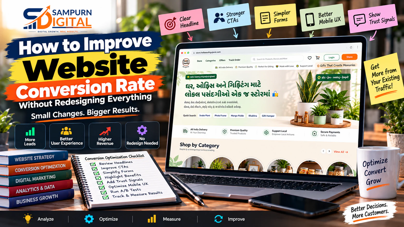
Your website doesn't always need a redesign.
Sometimes it needs better decisions.
A business may spend ₹2 lakh, ₹5 lakh or even ₹10 lakh redesigning a website—only to discover that the new website still generates roughly the same number of leads.
Why?
Because a conversion problem is not necessarily a design problem.
Your website might already have:
- Enough traffic
- Good branding
- Strong services
- Useful content
- A professional design
And still fail to convert visitors into enquiries.
The problem could be much smaller:
- Your headline doesn't explain the outcome.
- Your CTA is too generic.
- Your form asks for too much information.
- Your best proof is buried at the bottom.
- Your service page doesn't answer buying objections.
- Your mobile experience creates friction.
- Your visitors don't know what happens after submitting the form.
- Your traffic and landing-page message don't match.
Before rebuilding everything, find the smallest change that can create the biggest improvement.
This guide shows you how.
What Is Website Conversion Rate?
Website conversion rate measures the percentage of visitors who complete a desired action.
For a lead-generation website:
For example:
10,000 visitors
If you increase that to 3%, you now generate:
10,000 × 3% \= 300 leads
That's 100 additional leads without acquiring one additional visitor.
This is why conversion optimization can be extremely valuable.
You don't always need more traffic.
Sometimes you need to get more value from the traffic you already have.
The First Question: Do You Actually Need a Redesign?
Before touching your website, diagnose the problem.
A redesign may make sense when:
- The technology is outdated.
- The site isn't mobile-friendly.
- The information architecture is broken.
- Pages are difficult to manage.
- The website has major performance problems.
- The current structure doesn't support the business model.
- SEO architecture needs a major rebuild.
- The website cannot support required functionality.
But if the website technically works and visitors can already reach your important pages, start with optimization.
A useful decision tree is:
Is the website technically functional? ↓ YES ↓ Is traffic reaching the right pages? ↓ YES ↓ Can visitors understand the offer? ↓ NO → Fix messaging ↓ YES ↓ Are visitors taking the desired action? ↓ NO → Diagnose conversion friction ↓ Test → Measure → Improve
A website can be imperfect and still be highly profitable.
Start With the Numbers, Not the Design
Before changing anything, establish your baseline.
Suppose your website currently has:
| Metric | Current |
|---|---|
| Monthly visitors | 20,000 |
| Leads | 300 |
| Conversion rate | 1.5% |
| Qualified leads | 120 |
| Customers | 24 |
| Average customer value | ₹40,000 |
Monthly revenue influenced by those customers:
Now imagine conversion rate improves from:
At the same traffic:
20,000 × 2% \= 400 leads
Even if the qualified-lead percentage remains the same:
400 × 40% \= 160 qualified leads
That's potentially a significant business improvement without doubling traffic.
Find Your Highest-Value Pages
Don't optimize every page simultaneously.
Start with pages that have:
Typical candidates:
- Homepage
- Service pages
- Product pages
- Pricing pages
- Landing pages
- Contact pages
- High-intent organic pages
For example:
| Page | Visitors | Leads | Priority |
|---|---|---|---|
| Homepage | 8,000 | 60 | High |
| SEO Service | 2,000 | 70 | Very High |
| Blog A | 15,000 | 12 | Medium |
| Contact | 500 | 80 | Very High |
| About | 2,000 | 5 | Low |
The page with the highest traffic isn't automatically the best optimization target.
A service page generating 70 leads from 2,000 visitors may deserve more attention than a blog generating 12 leads from 15,000 visitors.
Find Where Visitors Drop Out
Think of your website as a funnel.
Traffic ↓ Page View ↓ Engagement ↓ CTA Click ↓ Form Start ↓ Form Submit ↓ Qualified Lead ↓ Sale
Your conversion problem could occur anywhere.
For example:
Scenario A
10,000 visitors
The issue may be the form.
Scenario B
10,000 visitors
The issue may be:
- Messaging
- Page relevance
- User experience
- Traffic quality
Don't optimize the wrong stage.
Improve the Hero Section Before Redesigning the Page
The hero section has one job:
Weak:
Digital Solutions for Modern Businesses
Better:
Grow Your Business With SEO, Paid Ads and Conversion-Focused Websites
Stronger:
Generate More Qualified Leads Without Wasting Your Marketing Budget
The best version depends on your audience.
Your hero should usually clarify:
- What you do
- Who you help
- What outcome you create
- What the visitor should do next
Replace Generic CTAs
“Contact Us” isn't necessarily wrong.
It's just often weak.
Compare:
Contact Us
with:
Request a Website Audit
or:
Get a Free Growth Consultation
or:
Request a Project Estimate
or:
Discuss Your Marketing Goals
The CTA should answer:
“What happens if I click this?”
Specificity reduces uncertainty.
Make the Offer Easier to Understand
Visitors don't convert because you have 15 services.
They convert because they understand what they can get and why it matters.
Instead of:
We provide comprehensive digital marketing solutions including SEO, PPC, social media, web development and content marketing.
Try:
We help service businesses generate more qualified enquiries through SEO, paid acquisition, social media and conversion-focused websites.
Then explain each service.
The second version establishes a business outcome first.
Reduce Form Friction
Look at every form field.
Ask:
“Does the sales team genuinely need this information before contacting the lead?”
Imagine your form contains:
- Name
- Phone
- Company
- Industry
- Location
- Website
- Monthly revenue
- Marketing budget
- Team size
- Project timeline
- Detailed requirements
That's a lot of commitment.
Try testing a shorter version.
Version A
11 fields.
Version B
4 fields:
- Name
- Phone/email
- Website
- Requirement
Then compare:
- Form-start rate
- Completion rate
- Qualified lead rate
- Sales conversion
Don't optimize for volume alone.
Improve Form Microcopy
Small copy changes can reduce uncertainty.
Instead of:
Submit
Try:
Request My Free Audit
Instead of:
Enter your phone number.
Try:
We'll call only if your requirement needs a discussion.
Instead of:
Message
Try:
Tell us what you want to improve.
Microcopy can explain:
- What happens next
- How information is used
- How quickly someone responds
- Whether the consultation is free
- Whether there is any obligation
Put Trust Near the Decision Point
Don't make visitors search for proof.
If you're asking someone to submit an enquiry, provide relevant evidence near that decision.
Examples:
- Client logos
- Case studies
- Reviews
- Results
- Certifications
- Years of experience
- Industry expertise
Instead of:
“We deliver excellent results.”
Show:
“Reduced cost per qualified lead from ₹1,850 to ₹1,120.”
Specific evidence is more useful than generic claims.
Add Relevant Case Studies
Case studies answer an important question:
“Has this company solved a problem like mine before?”
Structure them around:
Example:
Problem
A service company was generating website traffic but only 1.2% of visitors became leads.
Changes
- Reworked service-page messaging
- Simplified enquiry form
- Added relevant case studies
- Improved CTA placement
- Created dedicated landing pages
Result
Conversion rate increased to 2.1%.
The exact numbers should always be based on genuine business data.
Answer Buying Objections Directly
A visitor may not convert because they still have unanswered questions.
Typical objections include:
- How much does it cost?
- How long does it take?
- Do you work with businesses like mine?
- What exactly is included?
- Who will manage the project?
- What happens after I enquire?
- Can I see previous work?
- Is there a minimum commitment?
- Will I get measurable results?
Your website should answer these questions before the visitor needs to ask them.
Improve CTA Placement
Don't put one CTA at the top and disappear for the next 2,000 pixels.
A long service page can have natural conversion points.
For example:
Hero ↓ CTA ↓ Problem ↓ Solution ↓ Services ↓ Proof ↓ Process ↓ FAQ ↓ CTA
The CTA should appear when the visitor has enough information to make the next decision.
Not randomly.
Improve Mobile Conversion
A desktop website can look excellent while producing poor mobile conversions.
Check:
- CTA visibility
- Button size
- Form usability
- Input spacing
- Menu behaviour
- Text size
- Hero height
- Sticky elements
- Page speed
- Pop-ups
- WhatsApp/contact buttons
Imagine:
If 70% of your traffic is mobile, mobile optimization becomes a major business priority.
Fix Slow Pages
A visitor cannot convert if they leave before the page becomes usable.
Check:
- Large images
- Unnecessary JavaScript
- Third-party scripts
- Poor hosting
- Render-blocking resources
- Excessive plugins
- Unoptimized fonts
- Video loading
- Tracking scripts
Don't assume every performance issue requires a full rebuild.
Often, targeted technical improvements can make a significant difference.
Remove Unnecessary Distractions
Look at your page and ask:
“What is competing with the primary action?”
Potential distractions:
- Too many CTAs
- Excessive animations
- Multiple competing offers
- Unnecessary pop-ups
- Promotional banners
- Huge navigation menus
- Irrelevant links
- Repetitive sections
A conversion-focused page should have a clear priority.
Improve Above-the-Fold Clarity
The visitor should not need to scroll to understand:
- What you do
- Who you help
- Why you're different
- What they can do next
For example:
Weak
Welcome to Sampurn Digital.
Better
Digital Marketing That Turns Traffic Into Qualified Business Enquiries.
Supporting text:
SEO, paid advertising, social media and conversion-focused websites designed around measurable growth.
CTA:
Request a Growth Consultation
The visitor immediately has context.
Match Landing Pages to Traffic Sources
One generic landing page shouldn't necessarily serve every campaign.
Imagine you run:
But the landing page says:
Digital Marketing Services
That's a message mismatch.
A better experience would be:
SEO Services for Manufacturing Businesses
Then explain:
- Manufacturing-specific challenges
- Relevant services
- Relevant proof
- Relevant case studies
- Relevant CTA
This creates continuity from:
Navigation isn't only an SEO issue.
It can also influence conversion.
For example, someone reading a service page may need:
- Pricing information
- Case study
- About page
- Related service
- Contact page
Contextual links can move visitors toward the information they need.
A strong internal linking structure should help users discover the next logical page rather than simply adding links for SEO.
Turn High-Traffic Content Into Lead Assets
You may already have pages receiving thousands of organic visitors.
But they generate almost no leads.
Don't immediately rewrite the article.
First ask:
“What would a visitor need next?”
For example:
Article: “How to Reduce Google Ads Wasted Spend”
Add:
Download the Google Ads Audit Checklist
or:
Request a Paid Ads Account Audit
or:
Get a Campaign Review
The traffic already exists.
You are improving the path from information → commercial next step.
Use Different CTAs for Different Intent Levels
Not every visitor is ready to buy.
Consider:
Problem-aware
CTA:
Download the Checklist
Solution-aware
CTA:
See How the Process Works
Product/service-aware
CTA:
Request a Consultation
Ready-to-buy
CTA:
Get a Project Estimate
Matching CTA intensity to visitor intent can improve conversion quality.
Add FAQ Sections That Remove Friction
A good FAQ isn't just for SEO.
It can remove objections.
For a web development service:
How long does a website project take?
Explain the typical range and what affects it.
Can you improve our existing website?
Yes, if the current architecture is suitable.
Do you provide hosting?
Explain what is included.
Can you migrate an existing website?
Explain the process.
What happens after the enquiry?
Explain the next step.
Good FAQs can prevent hesitation at the exact point where someone is deciding whether to contact you.
Don't Change Five Things at Once
If you change:
- Headline
- CTA
- Form
- Layout
- Testimonials
and conversion increases, you don't know what caused it.
Instead, create a testing backlog.
For example:
| Test | Expected Impact | Effort | Priority |
|---|---|---|---|
| Hero headline | High | Low | 1 |
| Form reduction | High | Medium | 2 |
| CTA copy | Medium | Low | 3 |
| Case study placement | Medium | Low | 4 |
| Button colour | Low | Low | 10 |
This is where [website A/B testing priorities](https://chatgpt.com/blog/web-development/ab-testing-for-websites-what-should-you-test-first) become useful.
Measure Qualified Leads, Not Just Conversion Rate
This is critical for service businesses.
Suppose:
Before
100 leads
After
150 leads
Your conversion rate improved.
Your sales pipeline got worse.
So track:
And, where possible:
Ultimately:
These metrics tell you whether CRO is actually helping the business.
Diagnose the Funnel Before Spending More on Traffic
Suppose:
If your website conversion rate improves by 50%, the same advertising budget can potentially generate more leads.
That's why conversion optimization and paid acquisition should work together.
If you're already running paid campaigns, connect website CRO with your broader acquisition strategy and review whether changes are affecting lead quality and acquisition economics.
Don't Ignore the Sales Team
Your website doesn't operate independently.
Salespeople speak to real prospects every day.
Ask them:
- What questions do prospects repeatedly ask?
- Why do prospects hesitate?
- Which service is misunderstood?
- What objections stop deals?
- What information do prospects request before buying?
- Which leads are consistently poor quality?
Then turn those insights into website improvements.
For example:
Sales says:
“Almost every prospect asks whether you work with small businesses.”
Website improvement:
Add a clear section: “Yes—we work with startups, small businesses and established companies.”
One recurring sales objection can become a conversion improvement.
Use a 30-Day CRO Quick-Win Plan
You don't need a six-month redesign project to begin.
Days 1–5: Diagnose
Review:
- Analytics
- Traffic sources
- Top landing pages
- Conversion paths
- Forms
- Mobile performance
- User behaviour
- Sales objections
Days 6–10: Prioritize
Create 10–20 possible improvements.
Score them on:
- Business impact
- Traffic affected
- Evidence
- Implementation effort
Choose the top 3–5.
Days 11–20: Implement Quick Wins
Start with changes such as:
- Better headlines
- Stronger CTAs
- Form simplification
- Better proof placement
- Clearer service messaging
- FAQ improvements
- Mobile fixes
- Faster page loading
Days 21–30: Test and Measure
Track:
- Conversion rate
- CTA clicks
- Form starts
- Form completions
- Qualified leads
- Sales
- Revenue
Then decide:
The “Redesign vs Optimize” Decision Matrix
| Problem | Optimize First? | Redesign Likely? |
|---|---|---|
| Weak headline | Yes | No |
| Generic CTA | Yes | No |
| Long form | Yes | No |
| Weak testimonials | Yes | No |
| Poor mobile spacing | Yes | Maybe |
| Slow images | Yes | No |
| Broken navigation | Maybe | Yes |
| Outdated technology | No | Yes |
| Major architecture problems | No | Yes |
| Missing functionality | No | Yes |
| Poor offer positioning | Yes | Not necessarily |
| Low lead quality | Yes | Not necessarily |
The point isn't to avoid redesigns.
It's to avoid redesigning something that could be fixed through focused optimization.
10 High-Impact Website CRO Quick Wins
If you want a starting checklist, review these first:
- Rewrite the hero headline around an outcome.
- Make the primary CTA specific.
- Remove unnecessary form fields.
- Add relevant proof near the CTA.
- Put important objections into FAQs.
- Improve mobile form usability.
- Add CTAs at natural decision points.
- Match landing pages to traffic intent.
- Turn high-traffic content into relevant lead opportunities.
- Measure qualified leads—not just submissions.
These are not guaranteed winners.
They are high-value areas to investigate and test.
A Practical CRO Audit Scorecard
Score every area from 0 to 2:
- 0 \= Poor
- 1 \= Needs improvement
- 2 \= Strong
| Area | Score |
|---|---|
| Value proposition | /2 |
| Hero clarity | /2 |
| CTA clarity | /2 |
| Form friction | /2 |
| Trust signals | /2 |
| Social proof | /2 |
| Mobile UX | /2 |
| Page speed | /2 |
| Navigation | /2 |
| Offer clarity | /2 |
| FAQs | /2 |
| Conversion tracking | /2 |
| Lead quality tracking | /2 |
| Traffic-message match | /2 |
| Internal journey | /2 |
24–30
The fundamentals are relatively strong. Focus on testing and incremental optimization.
17–23
There are several meaningful opportunities.
Below 17
You probably have fundamental conversion problems to address before running sophisticated experiments.
This isn't a universal benchmark.
It's simply a practical prioritization tool.
When a Redesign Really Is the Better Choice
Optimization has limits.
A redesign may be justified when the existing website has structural problems such as:
- Completely outdated information architecture
- Poor mobile foundation
- Unusable CMS
- Severe technical debt
- Incompatible integrations
- Major security concerns
- Poor scalability
- No meaningful conversion journey
- Multiple business changes that the current structure cannot support
Before choosing between improving and rebuilding, review the fundamentals in the [website requirements checklist before hiring a developer](https://chatgpt.com/blog/web-development/website-requirements-checklist-before-hiring-a-developer).
And if you're deciding whether the current technology is sufficient, compare the implications of [WordPress vs custom development](https://chatgpt.com/blog/web-development/wordpress-vs-custom-development-how-should-a-business-decide).
The Biggest Mistake: Redesigning Without Diagnosing
Imagine a website generates:
The company spends:
The new website looks better.
But conversion remains:
Why?
Because nobody identified the actual bottleneck.
A redesign changed the appearance.
It didn't necessarily change:
- The offer
- The messaging
- The traffic quality
- The sales objections
- The CTA
- The form
- The customer journey
A better process is:
Measure ↓ Diagnose ↓ Prioritize ↓ Optimize ↓ Test ↓ Measure Again ↓ Redesign Only Where Necessary