
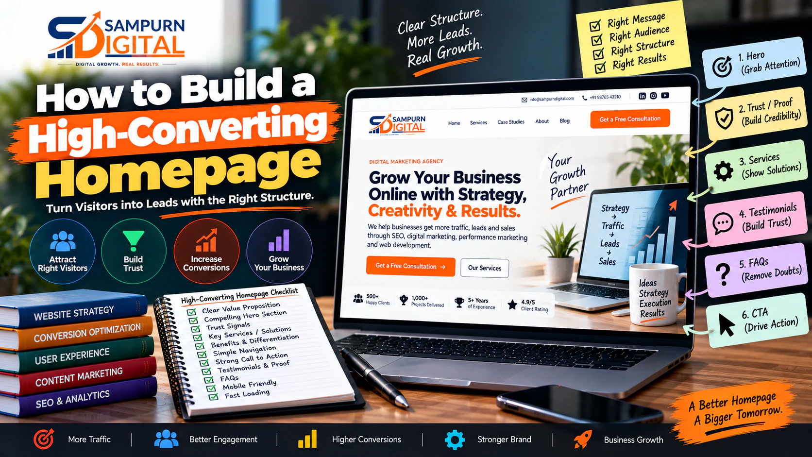
Your homepage is often the first page people see.
But that does not mean its job is to tell visitors everything about your company.
Its job is to help the right visitor quickly understand:
What do you do? Who is it for? Why should I trust you? What should I do next?
That sounds simple.
Yet many business homepages fail because they try to do too much.
They contain:
- A huge hero image
- A vague headline
- Ten services
- Company history
- Stock photos
- Generic testimonials
- Random statistics
- Multiple competing buttons
- A long list of features
- A blog section
- A newsletter
- A footer containing almost the entire website
The result?
The visitor lands on the page and still doesn't know what the company actually does.
A high-converting homepage is not necessarily the most beautiful homepage.
It is the homepage that creates a clear path from:
This guide explains how to build that structure.
What Is a High-Converting Homepage?
A high-converting homepage is a homepage designed to move the right visitors toward a meaningful business action.
Depending on the business, that action could be:
- Requesting a quote
- Booking a consultation
- Calling the business
- Starting a trial
- Purchasing a product
- Requesting a demo
- Filling out an enquiry form
- Visiting a physical location
- Contacting sales
The important point is:
For a B2B company, a qualified consultation may be the primary conversion.
For an e-commerce business, it may be a purchase.
For a local service business, it could be a phone call.
Your homepage structure should therefore begin with the business conversion goal, not the visual design.
The Basic Homepage Conversion Structure
A practical homepage can follow this framework:
Hero ↓ Trust / Proof ↓ Problem ↓ Solution ↓ Services / Products ↓ Why Choose Us ↓ Process ↓ Results / Case Studies ↓ Testimonials ↓ FAQs ↓ Primary CTA
You don't have to use every section.
The correct structure depends on:
- Business model
- Audience
- Buying cycle
- Product complexity
- Price
- Trust requirements
- Traffic source
But the sequence gives you a useful starting point.
Section 1: Start With a Clear Value Proposition
The first screen is your most valuable piece of homepage real estate.
Within a few seconds, the visitor should understand:
What you offer
Who you help
What outcome you create
A weak headline:
“Transforming Businesses Through Innovation”
A stronger headline:
“Performance Marketing That Helps E-commerce Brands Acquire More Customers Profitably”
The second statement is more specific.
It tells visitors:
- Service
- Audience
- Outcome
The Hero Formula
A useful formula is:
For example:
Web Development
“High-Performance Websites Built for Businesses That Need More Leads.”
SEO
“SEO Strategies That Turn Search Visibility Into Qualified Business Leads.”
B2B Software
“Project Management Software for Growing Construction Teams.”
The headline doesn't need to contain every keyword.
It needs to make the offer understandable.
Add a Supporting Statement
Your headline creates interest.
The supporting copy removes ambiguity.
For example:
“We design, develop and optimize business websites with conversion-focused UX, SEO-ready architecture and analytics built into the experience.”
Now the visitor understands what happens behind the headline.
Use One Primary CTA
The hero should normally have one dominant action.
Examples:
You can have a secondary action such as:
But don't give the visitor six equally important buttons.
Too many CTAs create decision friction.
Section 2: Add Immediate Trust
After the hero, reduce uncertainty.
Use evidence such as:
- Client logos
- Certifications
- Reviews
- Industry experience
- Project count
- Case-study results
- Years in business
- Ratings
- Awards
For example:
Trusted by 120+ businesses | 12+ years experience | 250+ projects delivered | 4.8/5 average client rating
Only use numbers you can substantiate.
Fake or inflated proof can damage trust rather than increase conversions.
Section 3: Address the Customer's Problem
Now demonstrate that you understand the visitor.
Instead of immediately saying:
“Here are our services.”
Start with:
“Why isn't your website generating enough qualified enquiries?”
Then describe the problems your audience experiences.
For example:
- Visitors leave without contacting you
- Traffic doesn't convert
- Your website is difficult to navigate
- Leads aren't qualified
- Mobile users struggle to use the site
- Your pages don't clearly explain your services
This changes the conversation from:
to:
Section 4: Explain the Solution
Once you've established the problem, introduce your solution.
A good solution section should explain:
- What you do
- How you do it
- Why your approach is different
- What outcome the visitor should expect
For example:
Audit ↓ Strategy ↓ Design ↓ Development ↓ Launch ↓ Optimization
Don't use complicated jargon unless your audience understands it.
Section 5: Present Your Core Services
Your homepage should introduce your main services without trying to explain everything.
For example:
SEO Improve organic visibility [Learn More]
Performance Marketing Generate measurable paid traffic [Learn More]
Social Media Build audience and demand [Learn More]
Web Development Build a faster, conversion-focused website [Learn More]
Each service should link to its dedicated page.
The homepage introduces.
The service page explains.
The landing page converts.
The case study proves.
That division keeps the homepage focused.
Don't Turn the Homepage Into a Services Catalogue
A common mistake is:
Our Services
SEO Local SEO Technical SEO E-commerce SEO Google Ads Meta Ads Content Marketing Email Marketing Website Development E-commerce Development UI/UX Branding Video Marketing Influencer Marketing ...
The visitor gets overwhelmed.
Instead, group services around the major business solutions.
For example:
Growth
SEO + Content + Performance Marketing
Digital Presence
Website Development + UX
Social
Organic Social + Paid Social
The homepage should create clarity, not list every capability your company has.
Section 6: Explain Who You Are Best For
A strong homepage should help visitors qualify themselves.
For example:
“We work with growing B2B and e-commerce businesses that already have a validated offer and want a measurable digital growth system.”
This tells the right visitor:
“This is for me.”
It also tells the wrong visitor:
“Maybe this isn't what I need.”
That's useful.
Better-qualified traffic often matters more than maximizing raw enquiry volume.
Section 7: Explain Why Customers Should Choose You
Avoid generic statements like:
- Best quality
- Professional team
- Customer-focused
- Innovative solutions
- Affordable pricing
Almost every company says these things.
Instead, explain specific differentiators.
For example:
Strategy Before Execution
We don't start development until the business goals, user journeys and technical requirements are defined.
Conversion-Focused UX
We design around the actions that matter to the business.
SEO-Ready Architecture
Pages, navigation, URLs and internal linking are planned before launch.
Transparent Reporting
Performance is measured against agreed business outcomes.
Specificity makes differentiation believable.
Section 8: Show Your Process
A visitor may like your service but still wonder:
“What happens after I contact them?”
Remove that uncertainty.
A simple process:
01 — Discovery Understand goals, audience and requirements.
02 — Strategy Define the roadmap and priorities.
03 — Execution Design, build and implement.
04 — Launch Test and deploy.
05 — Optimization Measure performance and improve.
A process section works especially well for high-consideration services.
Section 9: Put Results Before Excessive Claims
If you have measurable results, show them.
Instead of:
“We help businesses grow.”
Show:
+138% Qualified organic leads
\-31% Cost per qualified lead
+64% Conversion rate
2.4× Return on ad spend
But metrics need context.
A number without context can be meaningless.
Better:
“Reduced cost per qualified lead by 31% over six months after restructuring campaigns and landing pages.”
Now the visitor understands:
Section 10: Use Case Studies Strategically
Don't put 20 case studies on the homepage.
Show two or three of your strongest examples.
For each:
Client
Who was the business?
Problem
What were they struggling with?
Solution
What did you change?
Result
What measurable outcome occurred?
For example:
E-commerce Brand Problem: Rising acquisition costs Strategy: Restructured campaigns, improved landing pages and introduced creative testing Result: 42% lower customer acquisition cost
Then provide:
This gives visitors a path from claim → evidence.
Section 11: Add Testimonials That Actually Help
A testimonial like:
“Great company. Highly recommended\!”
provides almost no useful information.
A stronger testimonial explains:
- What problem existed
- Why the customer selected you
- What changed
- What result they experienced
For example:
“Our website was receiving traffic but generating very few enquiries. After restructuring the pages and improving the conversion journey, qualified enquiries increased significantly.”
Specificity makes testimonials useful.
Section 12: Handle Common Objections
A visitor may have questions such as:
- How much does it cost?
- How long does it take?
- Do you work with companies in my industry?
- Can you work with our existing team?
- What access do you need?
- What happens after I enquire?
- Do you offer ongoing support?
You don't need to answer every question on the homepage.
But address the biggest objections.
This can be done through:
- FAQs
- Process section
- Service pages
- Case studies
- Pricing guidance
- Consultation CTA
Section 13: Make the CTA Match the Buying Stage
Not every visitor is ready to buy.
Someone discovering your company for the first time may want:
Someone comparing providers may want:
Someone ready to talk may want:
A strong homepage can provide multiple levels of commitment:
Low Commitment Read a Guide ↓ Medium Commitment View Case Studies ↓ High Commitment Request Consultation
This allows different visitors to progress naturally.
Section 14: Design the Homepage Around Traffic Sources
Not all visitors arrive with the same intent.
Consider:
Organic Search
Visitors may arrive with a specific problem or service intent.
Paid Ads
Visitors often arrive with a tightly defined campaign promise.
Social Media
Visitors may know your brand but not your offer.
Direct Traffic
Visitors may already know you.
Referral Traffic
Visitors may arrive because someone recommended you.
Your homepage should therefore be clear enough for unfamiliar visitors while providing obvious routes for people who already know what they want.
Section 15: Don't Force Every Visitor Through the Same Journey
A sophisticated homepage provides multiple paths.
For example:
               HOMEPAGE
                   │
   ┌───────────────┼────────────────┐
   ↓               ↓                ↓
Need SEO Need Website Need Ads ↓ ↓ ↓ SEO Service Web Development Paid Marketing ↓ ↓ ↓ Case Study Portfolio Results ↓ ↓ ↓ CTA CTA CTA
This is much better than:
Homepage ↓ About ↓ Services ↓ Contact
The website should adapt to user intent.
Section 16: Make the Homepage Mobile-First
A homepage that converts on desktop can still fail on mobile.
Check:
- Hero text readability
- Button size
- Menu usability
- Form fields
- Image loading
- Section spacing
- Sticky CTA
- Tap targets
- Typography
- Page speed
Imagine someone opening your website on a phone with one hand.
Can they:
- Understand what you offer?
- Find the relevant service?
- Trust the company?
- Contact you?
If not, the homepage needs work.
Section 17: Keep the Hero Visually Focused
Your hero should have one clear focal point.
Avoid placing:
- Four headlines
- Six icons
- A carousel
- Multiple animated elements
- Three CTAs
- A giant paragraph
- Five badges
all above the fold.
A clean structure is usually stronger:
Headline
Supporting message
[Primary CTA] [Secondary CTA]
Trust indicator / proof
Relevant visual
The visual should support the message.
It should not compete with it.
Section 18: Use Visuals That Explain Something
A stock photo of a smiling person holding a laptop rarely explains your service.
Better visuals could include:
- Product interface
- Before/after comparison
- Website preview
- Dashboard
- Real project screenshots
- Process diagram
- Product demonstration
- Relevant photography
Ask:
“Does this image help the visitor understand, trust or desire the solution?”
If not, it may simply be decoration.
Section 19: Make Forms Easy
If your homepage contains a lead form, don't ask for 18 fields immediately.
Weak:
- Full name
- Company name
- Job title
- Phone
- Address
- Website
- Industry
- Company size
- Revenue
- Budget
- Service
- Message
- Preferred meeting time
- etc.
For a first interaction, something like:
Name Email Business / Website What do you need help with? [Submit]
may create less friction.
The right form length depends on lead quality requirements, but every field should have a reason.
Section 20: Build Trust Before Asking for a Major Commitment
If your service costs ₹2,00,000, ₹5,00,000 or more, a visitor may not be ready to click:
They may need:
- Results
- Case studies
- Testimonials
- Process
- Expertise
- FAQs
- Consultation
The homepage should therefore reduce perceived risk before asking for a high-commitment action.
A Practical Homepage Wireframe
Here's a useful starting blueprint:
┌───────────────────────────────────┐ │ LOGO NAVIGATION CTA │ ├───────────────────────────────────┤ │ │ │ VALUE PROPOSITION │ │ │ │ Supporting statement │ │ │ │ [PRIMARY CTA] [SECONDARY] │ │ │ │ Trust indicator │ ├───────────────────────────────────┤ │ CLIENT PROOF │ ├───────────────────────────────────┤ │ CUSTOMER PROBLEM │ ├───────────────────────────────────┤ │ YOUR SOLUTION │ ├───────────────────────────────────┤ │ CORE SERVICES │ ├───────────────────────────────────┤ │ WHY CHOOSE US │ ├───────────────────────────────────┤ │ PROCESS │ ├───────────────────────────────────┤ │ CASE STUDIES / RESULTS │ ├───────────────────────────────────┤ │ TESTIMONIALS │ ├───────────────────────────────────┤ │ FAQ │ ├───────────────────────────────────┤ │ FINAL CTA │ ├───────────────────────────────────┤ │ FOOTER │ └───────────────────────────────────┘
This is a framework, not a mandatory template.
A SaaS company, law firm, restaurant, manufacturer and marketing agency should not have identical homepages.
Homepage SEO Structure
Conversion optimization should not mean ignoring SEO.
Your homepage still needs clear relevance.
Focus on:
Title tag
Describe the company and its primary offering.
H1
Clearly communicate the main value proposition.
Supporting headings
Use logical H2/H3 sections.
Internal links
Connect the homepage to important service and resource pages.
Image optimization
Use descriptive filenames and useful alt text where appropriate.
Performance
Don't allow large visual assets to destroy page speed.
Structured content
Make important information easy for users and search engines to understand.
The homepage should establish the website's overall topical and commercial context.
Homepage vs Service Page
One of the biggest mistakes is putting everything onto the homepage.
Use the homepage to answer:
Who are you? What do you offer? Who do you help? Why trust you? Where should I go next?
Use service pages to answer:
What exactly is this service? How does it work? What's included? Who needs it? What does it cost or depend on? What results can it produce? Why choose you?
That separation creates a cleaner website.
For businesses still deciding what type of web property they actually need, see [Business Website vs Landing Page vs Web Application: What Do You Actually Need?](https://chatgpt.com/blog/web-development/business-website-vs-landing-page-vs-web-application-what-do-you-actually-need).
Homepage vs Landing Page
These are not interchangeable.
Homepage
Broad audience.
Multiple journeys.
Brand + positioning + navigation.
Landing page
Specific audience.
Specific campaign.
Specific offer.
Specific conversion.
For example:
Google Ad ↓ “Google Ads Management for E-commerce” ↓ Dedicated Landing Page ↓ Consultation
Sending that visitor to a generic homepage may introduce unnecessary friction.
The Homepage Conversion Equation
A useful mental model is:
You don't need to calculate this numerically.
Use it diagnostically.
Low relevance
The visitor doesn't feel the website is for them.
Low clarity
They don't understand the offer.
Low trust
They aren't convinced you can deliver.
Low motivation
They don't see enough value in acting now.
High friction
The action feels difficult.
Improving any of these can improve conversion performance.
Example: Diagnosing a Weak Homepage
Suppose a website receives:
and generates:
Conversion rate:
You investigate.
Problem 1
The hero says:
“Building Tomorrow's Digital World.”
Visitors don't know what the company sells.
Problem 2
Services are buried below eight sections.
Problem 3
There are no case studies.
Problem 4
The CTA says:
“Submit”
Problem 5
The form requires 12 fields.
Instead of simply redesigning the colors, you could restructure:
- Clearer value proposition
- Better service visibility
- Stronger proof
- Specific CTA
- Shorter initial form
The goal isn't to make the page “prettier.”
It is to remove conversion barriers.
40-Point High-Converting Homepage Checklist
Positioning
- Offer is immediately understandable
- Target audience is clear
- Main outcome is clear
- Value proposition is specific
- Messaging matches actual service
Hero
- One clear H1
- Supporting copy is concise
- Primary CTA is obvious
- Secondary CTA is optional
- Visual supports the message
Trust
- Client proof is visible
- Testimonials are credible
- Case studies are accessible
- Relevant credentials are shown
- Claims can be substantiated
Services
- Core services are easy to find
- Service categories are logical
- Each service links to a deeper page
- Homepage doesn't explain everything
- Priority services receive appropriate visibility
Conversion
- Primary CTA is consistent
- CTA wording is specific
- Forms aren't unnecessarily long
- Contact options are easy to find
- Next steps are clear
UX
- Navigation is understandable
- Mobile menu works well
- Typography is readable
- Buttons are easy to tap
- Important information is easy to scan
Performance
- Images are optimized
- Videos are controlled
- Third-party scripts are reviewed
- Page doesn't contain unnecessary animations
- Core performance metrics are monitored
SEO
- Title is relevant
- H1 is clear
- Heading hierarchy is logical
- Important service pages are linked
- Content supports the site's primary topic
What Not to Put on Your Homepage
You don't need everything.
Be cautious with:
- Huge company history
- Every employee's profile
- Every service detail
- Dozens of blog posts
- Generic stock photography
- Decorative animations
- Auto-playing videos
- Multiple sliders
- Unnecessary pop-ups
- Excessive awards
- Unverified statistics
If something doesn't help:
question whether it belongs.
How to Test a Homepage Before Launch
Don't ask only:
“Does everyone like the design?”
Test specific questions.
Show the homepage to someone unfamiliar with the business for 5–10 seconds.
Then ask:
What does this company do?
If they cannot answer, your positioning is weak.
Who is this for?
If they cannot answer, your audience isn't clear.
What would you click?
This reveals whether the CTA and navigation are understandable.
Why would you trust them?
This exposes weaknesses in your proof.
What would stop you from contacting them?
This reveals friction and unanswered objections.
You can also test:
- CTA clicks
- Form starts
- Form completions
- Service-page clicks
- Case-study clicks
- Scroll depth
- Mobile vs desktop conversion
- Conversion rate by traffic source
Homepage Improvement Prioritization
When a homepage isn't converting, don't randomly change everything.
Prioritize:
Message
Does the visitor understand the offer?
Relevance
Does the page feel designed for the target customer?
Proof
Is there enough evidence?
CTA
Is the next action obvious?
Friction
Is anything unnecessarily difficult?
Layout
Does the visual hierarchy guide the visitor?
Performance
Does the site load and respond properly?
This order prevents teams from spending weeks changing button colors while ignoring unclear messaging.
The 5-Question Homepage Test
Before launch, make sure your homepage answers these five questions within seconds:
What do you do?
Clear offer.
Who do you help?
Clear audience.
Why should I believe you?
Proof.
Why should I choose you?
Differentiation.
What should I do next?
CTA.
If the visitor needs to scroll through half the page to answer these questions, the homepage needs stronger information hierarchy.