
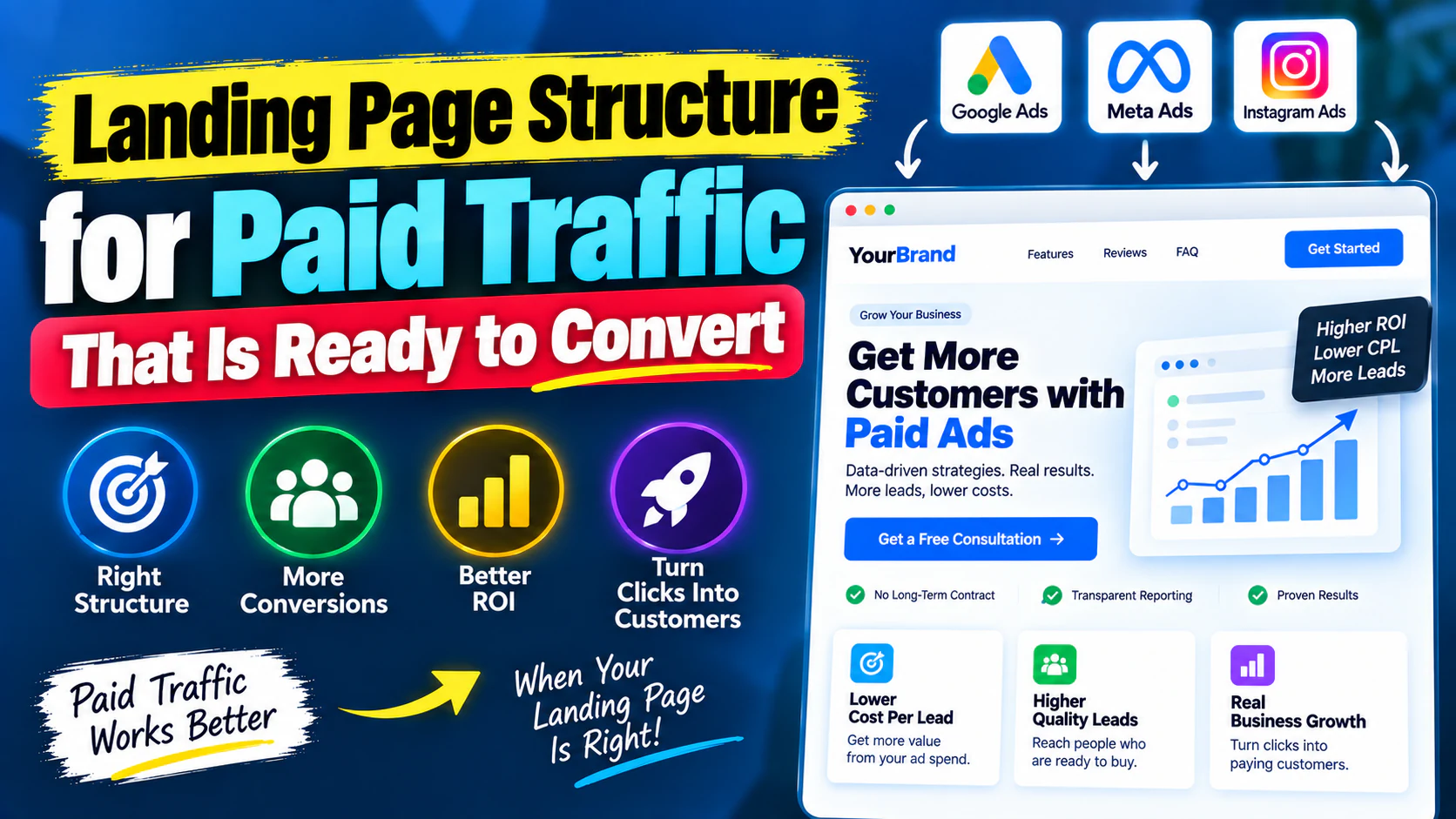
You can have the right audience.
You can have a strong ad.
You can have a competitive offer.
And still waste a large part of your advertising budget.
The reason?
Paid traffic is expensive because every visitor has a cost attached to it. If 1,000 people click your ads and the landing page fails to convince them to take the next step, improving the ad alone will not solve the problem.
This is why a landing page for paid traffic should not be treated like a normal website page.
A normal website is designed to help people explore.
A paid-traffic landing page is designed to help a specific visitor make a specific decision.
That difference changes everything:
- the headline,
- page structure,
- copy,
- navigation,
- proof,
- CTA,
- form,
- visuals,
- and even what you choose to remove.
In this guide, we'll break down a practical PPC landing page structure that connects the ad promise to the conversion action.
What Is a Paid-Traffic Landing Page?
A paid-traffic landing page is a page specifically designed to receive visitors from advertising campaigns and move them toward a defined conversion.
That conversion could be:
- submitting a lead form,
- booking a consultation,
- requesting a quote,
- starting a trial,
- purchasing a product,
- downloading something,
- or taking another commercially valuable action.
The key is that the page has one primary job.
For example:
or:
or:
The page should continue the conversation that started in the advertisement.
Why Paid Traffic Needs a Different Page Structure
Consider this journey:
Ad: “Reduce wasted Google Ads spend.”
Landing page: “Welcome to Sampurn Digital. We offer SEO, social media, web development, branding and digital marketing services.”
The visitor clicked because of one problem.
The page immediately introduces five different categories.
That creates friction.
The visitor now has to figure out:
- where they are,
- whether the page is relevant,
- what service they need,
- why they should trust you,
- and what they should do next.
A strong paid landing page removes that work.
The page should make the next decision feel obvious.
The Core Principle: Message Match
The most important concept in paid-traffic landing pages is message match.
Your ad makes a promise.
Your landing page should immediately confirm that promise.
For example:
Ad
Landing-page headline
That feels connected.
Now compare it with:
Ad
Landing page
The second page may describe a good service, but it does not immediately reinforce why the visitor clicked.
The closer the connection between ad → headline → offer → CTA, the less cognitive work the visitor has to do.
The Ideal Paid-Traffic Landing Page Structure
A practical high-converting paid-traffic page can follow this sequence:
This is not a rigid formula.
The exact structure should depend on:
- traffic source,
- audience awareness,
- offer complexity,
- price,
- buying cycle,
- and conversion goal.
But it gives you a strong starting point.
Section 1: Above-the-Fold Area
The first screen has one critical job:
Do not try to explain your entire company above the fold.
Focus on four things:
What is this?
Make the offer immediately understandable.
Who is it for?
Help the visitor recognise relevance.
Why should I care?
Communicate the strongest benefit or outcome.
What should I do next?
Provide a clear CTA.
A useful structure is:
What outcome/problem does this solve?
Who is it for + how it works.
The next logical action.
A relevant trust signal near the decision point.
Write the Headline Around the Visitor
Weak headline:
“Performance Marketing Services”
Better:
“Turn Paid Traffic Into Qualified Leads, Not Just Clicks.”
Even better when the audience and offer are known:
“Find the Conversion Leaks Wasting Your Paid Advertising Budget.”
The headline should not simply describe what the company does.
It should communicate why the visitor should continue reading.
Section 2: Supporting Value Proposition
The headline gets attention.
The supporting copy should add context.
For example:
“We analyse your campaigns, landing pages, tracking and conversion journey to identify where paid traffic is being lost.”
Now the visitor understands what happens next.
Avoid filling this section with vague claims such as:
- Best-in-class service
- Result-driven solutions
- Innovative strategies
- 360-degree marketing
- Customer-centric approach
These phrases sound polished but rarely answer the visitor's real question:
Section 3: Make the CTA Obvious
Your CTA should describe the action.
Weak:
Better:
Better still when appropriate:
The visitor should know what happens after clicking.
For a service business, useful CTA language could include:
- Request an Audit
- Get a Strategy Consultation
- Request a Proposal
- Book a Consultation
- Talk to an Expert
For e-commerce:
- Shop Now
- View Product
- Get the Offer
- Buy Now
Do not use five different primary CTAs competing with each other.
Choose the action that represents the page's main conversion goal.
Section 4: Add Proof Before Asking for Too Much Trust
Paid visitors may have never heard of you.
You are asking them to trust your business with:
- their money,
- contact information,
- time,
- or business problem.
Proof reduces that uncertainty.
Depending on the business, proof can include:
Testimonials
Show what customers actually experienced.
Case studies
Explain:
Client logos
Useful when they genuinely establish credibility.
Ratings or reviews
Relevant when they represent real customer experience.
Results
Use specific, verifiable numbers where you can substantiate them.
Avoid fake precision.
“Helped businesses grow” is vague.
“Generated 2.4× more qualified enquiries over six months” is useful only if you can actually support it.
Section 5: Address the Problem
Once the visitor understands the offer, demonstrate that you understand their situation.
For example:
Are you facing these problems?
- Your ads generate clicks but few enquiries.
- Leads arrive but sales teams say they are poor quality.
- Your landing page gets traffic but conversion rates remain low.
- You keep increasing ad spend without understanding the return.
- Different campaigns send traffic to the same generic website page.
This works because the visitor can recognise their own situation.
You are not simply saying:
You are saying:
Section 6: Explain the Solution Through Benefits
Do not stop at listing features.
Translate the service into outcomes.
Feature
Campaign audit.
Benefit
Identify where spend is being lost before scaling the budget.
Feature
Landing-page analysis.
Benefit
Find friction between the ad click and conversion.
Feature
Conversion tracking review.
Benefit
Make optimisation decisions using more reliable data.
This distinction is crucial for paid landing-page copy.
Visitors are rarely buying the feature.
They are buying the result or reduction in risk associated with it.
Section 7: Show How It Works
A simple process reduces uncertainty.
For example:
Step 1 — Audit
Review campaigns, traffic, tracking and conversion journey.
Step 2 — Diagnose
Identify the highest-impact performance problems.
Step 3 — Prioritise
Separate critical fixes from low-impact optimisation ideas.
Step 4 — Implement
Apply changes across campaigns, landing pages and measurement.
Step 5 — Optimise
Measure results and continuously improve based on evidence.
This answers the visitor's hidden question:
Section 8: Make the Offer Specific
The visitor should understand exactly what they are getting.
For example, instead of:
“Our experts will analyse your marketing.”
Use:
- Campaign structure review
- Search-term or audience analysis
- Creative review
- Conversion tracking check
- Landing-page assessment
- Budget allocation review
- Conversion-quality analysis
- Prioritised optimisation recommendations
Specificity increases perceived value because the visitor can visualise the deliverable.
Section 9: Handle Objections
Many conversions are lost because the landing page answers the questions the business wants to answer—not the questions the buyer actually has.
Common objections include:
“Will this work for my business?”
Explain who the service is designed for.
“How much does it cost?”
If pricing can be shown clearly, consider showing it. If not, explain how pricing is determined.
“How long does it take?”
Set realistic expectations.
“What happens after I submit the form?”
Tell them.
“Do I have to sign a long-term contract?”
If relevant, answer directly.
“Will I receive a report?”
Explain exactly what is included.
The best landing pages remove uncertainty before the visitor has to ask.
Section 10: Use FAQs Strategically
FAQs should not exist simply because SEO experts say every page needs FAQs.
On a paid landing page, FAQs should remove conversion objections.
For example:
These questions help visitors who are interested but not yet ready to commit.
Section 11: Repeat the CTA at the Right Moments
A long landing page should not force the visitor to scroll back to the top.
Place relevant CTA opportunities after important decision points.
For example:
But don't turn every section into a giant sales pitch.
The CTA should appear when the visitor has received enough information to reasonably take action.
Landing Page Form Structure
Your form can have a major impact on conversion rate.
Every additional field creates friction.
But reducing every form to:
is not automatically better.
You need enough information to determine whether the lead is useful.
For a B2B marketing enquiry, you might need:
- Name
- Business email
- Company
- Website
- Monthly marketing budget
- Primary challenge
But don't collect information just because your CRM supports it.
Ask:
If the answer is no, remove it.
Short Form vs Long Form
A shorter form generally creates less friction.
A longer form can provide better qualification.
So the goal isn't:
The goal is:
For a high-value B2B service, a few qualification questions may be worth the additional friction.
For a low-cost e-commerce purchase, unnecessary form complexity can be much more damaging.
Should You Remove the Website Navigation?
This is one of the most debated landing-page decisions.
There is no universal rule.
Removing unnecessary navigation can reduce distractions and keep visitors focused on the intended action.
But navigation can also help visitors who need additional information before converting.
The right question is:
If your campaign is highly specific and conversion-focused, a simplified navigation structure may make sense.
If trust requires visitors to inspect your company, portfolio or resources, selective navigation may be useful.
Test based on your audience and conversion data.
Landing Page Structure by Traffic Source
The page should also reflect where the visitor came from.
Google Search Ads
Search traffic often has stronger existing intent.
The page should focus quickly on:
- relevance,
- solution,
- proof,
- offer,
- conversion.
If someone searches:
and your landing page spends half the page explaining what digital marketing is, you are probably wasting valuable space.
Meta Ads
Meta traffic can be less immediately intent-driven.
The visitor may have been interrupted while consuming content.
Your page may therefore need more:
- context,
- education,
- visual proof,
- problem awareness,
- differentiation.
The ad creates interest.
The landing page should build that interest into consideration.
Retargeting Traffic
Retargeting visitors already know something about your business.
You can often be more direct.
For example:
The visitor doesn't need the same introduction as someone seeing your brand for the first time.
The Ad-to-Landing-Page Connection
Think of your paid acquisition journey as one sentence.
Ad
Landing page headline
Proof
Offer
CTA
If these pieces feel disconnected, conversion friction increases.
Example: Turning a Generic Page Into a Paid Landing Page
Generic version
Headline: Digital Marketing Services
Copy: We provide SEO, social media, web development, branding and performance marketing solutions.
CTA: Contact Us
The visitor has to figure out what matters.
Paid-traffic version
Headline: Find Out Why Your Paid Ads Generate Clicks but Not Enough Customers
Supporting copy: Get a practical review of your campaign structure, traffic quality, landing page and conversion tracking before you increase your advertising budget.
CTA: Request a Paid Campaign Audit
Proof: Relevant case study / testimonial / measurable result.
- Campaign structure
- Targeting
- Search terms or audience signals
- Creative
- Landing page
- Conversion tracking
- Budget allocation
Now the page has a clear job.
Common Paid Landing Page Mistakes
Sending paid traffic to the homepage
Your homepage may be useful for exploration.
It is not automatically the best destination for a specific advertising promise.
Talking about the company first
Visitors usually care about their problem before your company history.
Lead with relevance.
Too many CTAs
If the visitor can:
- call,
- WhatsApp,
- download,
- subscribe,
- book,
- browse services,
- read a blog,
- follow Instagram,
- and contact sales,
you may be creating decision fatigue.
Choose a primary action.
Generic headlines
“Grow Your Business With Our Innovative Solutions” tells the visitor almost nothing.
Specificity wins.
No proof
You're asking for trust without providing evidence.
Weak forms
A form that is too long can hurt conversion.
A form that is too short can produce unusable leads.
No mobile optimisation
Paid social traffic can be heavily mobile-driven.
If the page is difficult to use on a phone, your ad budget is effectively paying for friction.
Slow page experience
Visitors shouldn't have to wait unnecessarily to understand the offer.
Page performance is part of conversion optimisation.
No measurement
If you cannot reliably measure:
you cannot confidently optimise the full funnel.
How to Measure a Paid Landing Page
Don't judge the page using conversion rate alone.
Look at the complete journey.
Traffic
- Impressions
- Clicks
- CTR
- CPC
Landing-page behaviour
- Landing-page visits
- Engagement
- Scroll behaviour where useful
- CTA interactions
- Form starts
Conversion
- Form submissions
- Purchases
- Bookings
- Conversion rate
- Cost per conversion
Business quality
- Qualified leads
- Sales opportunities
- Revenue
- Customer acquisition cost
- Return on ad spend where applicable
This prevents a common mistake:
What Should You A/B Test First?
Don't change everything simultaneously.
Test one meaningful variable at a time where practical.
Good testing candidates include:
Headline
Version A:
Version B:
CTA
vs
Form length
Short vs qualified.
Proof placement
Test whether proof works better immediately after the hero or closer to the CTA.
Offer framing
For example:
vs
The best test is not the one that produces the biggest visual difference.
It is the one that answers an important business question.
A Simple Paid Landing Page Audit
Before sending more traffic, review the page using these questions.
Relevance
- Does the headline match the ad?
- Is the offer immediately clear?
- Does the visitor know they are in the right place?
Value
- Is the benefit obvious?
- Is the outcome specific?
- Does the page explain what the visitor gets?
Trust
- Is there credible proof?
- Are claims supported?
- Are objections addressed?
Conversion
- Is there one clear primary CTA?
- Is the form appropriate?
- Is the next step obvious?
Experience
- Is the page mobile-friendly?
- Does it load quickly?
- Is the layout easy to scan?
- Are unnecessary distractions removed?
Measurement
- Are conversions tracked?
- Can you connect conversions back to campaigns?
- Can you distinguish leads from qualified leads?
If several answers are “no,” increasing ad spend is probably not your first priority.
The 5-Second Test
Open your landing page and ask someone who has never seen it before:
Give them a few seconds.
If they cannot answer, your page probably has a clarity problem.
Then ask:
Then:
A strong landing page should make all three answers relatively easy.
Paid Traffic Landing Page Checklist
Before launching a campaign, confirm:
Above the fold
- Clear headline
- Relevant supporting copy
- Strong value proposition
- Primary CTA
- Initial trust signal
Body
- Problem
- Solution
- Benefits
- Process
- Offer details
- Proof
- Objection handling
- FAQs
Conversion
- Appropriate form length
- Clear CTA
- Mobile-friendly experience
- Minimal unnecessary friction
Tracking
- Conversion event configured
- Form submissions tracked
- Thank-you or confirmation behaviour tracked
- Lead quality measured downstream
Message match
- Ad promise matches headline
- Ad offer matches page offer
- CTA matches expected next step
- Visual language is consistent
Final Framework
A high-performing paid landing page does not need to be complicated.
It needs to answer the visitor's questions in the right order:
If your page answers those questions clearly, your advertising has a much stronger chance of turning paid traffic into meaningful business outcomes.
Because the real goal of paid advertising isn't to generate more clicks.